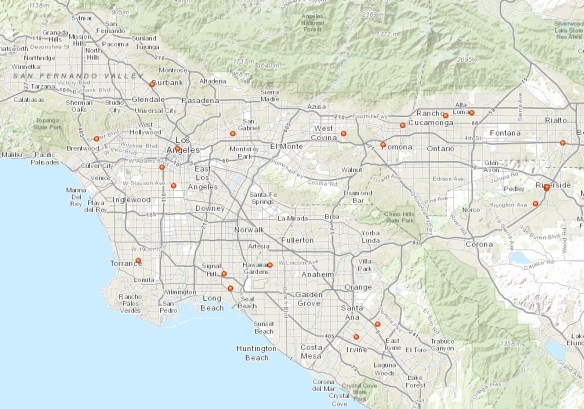
GIS Day is Wednesday, November 18th. If you are looking for a site to visit, check out this interactive map for the SoCalGIS area (and beyond).
Location data from gisday.com.
GIS Day is Wednesday, November 18th. If you are looking for a site to visit, check out this interactive map for the SoCalGIS area (and beyond).
Location data from gisday.com.
Free webcast today, starts at 11am PST! Hurry and sign up!
Southern California’s Shrinking Salton Sea: Mapping, Managing and Mitigating New PM10 Air Pollution Sources
Abstract:
The Imperial Irrigation District (IID) Water Conservation and Transfer Project includes a long-term transfer of up to 303,000 acre-feet of water annually from IID to the San Diego County Water Authority, and the Coachella Valley Water District. The Water Transfer Project, along with other factors affecting Salton Sea inflows and water balance, will result in accelerated exposure of the Salton Sea floor. As the Sea continues to recede, there is potential for windblown dust emissions from the exposed dry lakebed (the playa). A significant portion of this windblown dust is PM10 (particulate matter with an aerodynamic diameter of 10 micrometers or less). PM10 are approximately 1/7th the thickness of a human hair, are small enough to be inhaled, and represent a potential human health risk.
The Salton Sea Air Quality Program is focused on monitoring and mitigating dust emissions from exposed Salton Sea playa. Remote sensing is a key component of this program, and will be used to map playa surfaces, vegetative cover, and active dust source areas. Learn how satellite, aerial and UAV images all contribute to this effort and how they are being processed using Trimble eCognition image analysis software. The presentation will also discuss dust control pilot projects, such as Surface Roughening, and the remote sensing techniques used to inform design and evaluate dust control effectiveness.
The California Environmental Protection Agency released a study that identifies areas across California experiencing hotter summer temperatures as a byproduct of urban development.
Urban areas have higher temperatures during summer compared with adjacent rural communities, a phenomenon known as the urban heat island. Heat islands are created by a combination of dark pavement and roofs that absorb heat, heat-generating activities such as engines and generators, and the absence of vegetation that provides evaporative cooling.
While the phenomenon is well-known, the study for the first time creates an Urban Heat Island Index (UHII) to quantify the extent and severity of the heat island effect for individual cities throughout the state. The study found temperature increases ranging from a few degrees in small cities and coastal areas to as much as 19 degrees on average over a day in large, inland urban areas.
Click below to read the report on how the Urban Heat Island Index was created and view the maps and data for different urban areas.
For those of you interested in what went on at the National Geospatial Advisory Committee Meeting on September 1-2 in West Virginia, here is a recap of that meeting.
LA County will be celebrating GIS Day in November and you are invited to attend. For more information, visit their announcement page.
A new NASA satellite image shows that California is sinking even faster than scientists had thought.
Some areas of the central valley are sinking more than 2 inches per month. The rate of sinking is accelerating because the state’s extreme drought is fueling voracious groundwater pumping. Click below for the story.
The Association of American Geographers is looking for a diverse group of individuals representing a range of employment sectors, organizations, academic and professional backgrounds, to attend their Geography Careers event in 2016. For more information and to attend, click here.
A friend of mine is currently working on looking at the issue of sexism within the field of GIS and would like to gather input from the greater GIS community via a survey. You can find the post and survey here.
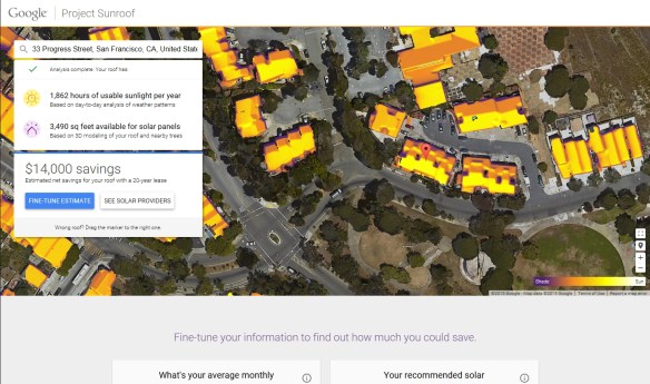
Looks like Google is starting to calculate solar information on their building data. They started Project Sunroof to make installing solar panels easy and understandable for anyone by calculating the best solar plan.
Does that sound familiar? It should since LA County has done that already with their Solar Map.
When you enter an address, Project Sunroof looks up the address in Google Maps and combines the map data with other databases to create a personalized roof analysis. They compute how much sunlight hits your roof using their 3D building models, shadows cast by nearby structures and trees, sun positions over the year, and historical cloud and temp patterns. They then recommend an installation size for your roof and reference local solar providers.
Currently Project Sunroof only covers Boston where the Sunroof Team is, the San Francisco Bay area where Google is, and Fresno … where one of the engineer’s mom lives.
Once they figure out the LA area, it will be interesting to compare it to LA County’s Solar Map information.
Take a look at the short video and visit the Project Sunroof website for more info.
ESRI has published the 4th edition of Getting to Know ArcGIS. Many of you have probably used past editions to learn the ArcGIS Desktop software or to teach others.
This edition is updated for the latest version of ArcGIS Desktop, 10.2 to 10.3.1. The book teaches GIS concepts and common tasks like how to find GIS data online, create web maps, set map projections, symbolize and label maps, edit GIS data, and geocode address locations. Included is a preview of ArcGIS Pro, however the book focuses on all the tools and functionality available in ArcGIS Desktop 10.3.1.
Getting to Know ArcGIS, 4th Edition was authored by Michael Law and Amy Collins. It is 808 pages long and retails for $84.99 from ESRI Press or about $54 to $58 on Amazon at the time of this post. The book also includes data for the exercises and a 180 day free trial of ArcGIS Desktop available for download at ESRI’s book resources website.