150 years ago the completion of the transcontinental railroad on May 10, 1869 marked an important milestone in the history of the United States with the joining of the populated east with the growing cities and towns of the west. Stanford University, with its connection to Leland Stanford and Timothy Hopkins, holds in its libraries an impressive array of materials related to this monumental achievement including the often overlooked contributions of the Chinese railroad workers. A new Spotlight exhibit, Transcontinental Railroad, pulls together this material to give an overview of the people and places that played a role in transforming the west. There are maps too! Check it out.
Monthly Archives: April 2019
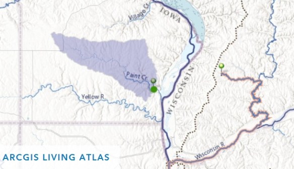
Create Watersheds and Trace Downstream for Free
2018 NAIP Imagery
Looking for 2018 NAIP imagery of California? The 2018 NAIP county mosaics are available for download now. The imagery is available in both natural color and near infrared.
What is NAIP? NAIP stands for the National Agriculture Imagery Program. NAIP acquires digital ortho imagery during the agricultural growing seasons in the continental US. NAIP provides 60 centimeter ground sample distance (GSD) ortho imagery rectified to a horizontal accuracy within +/- 4 meters of reference digital ortho quarter quads (DOQQ’s) from the National Digital Ortho Program (NDOP) or from the National Agriculture Imagery Program (NAIP). The tiling format of NAIP imagery is based on a 3.75′ x 3.75′ quarter quadrangle with a 300 pixel buffer on all four sides. The NAIP imagery is formatted to the UTM coordinate system using the North American Datum of 1983 (NAD83). NAIP imagery may contain as much as 10% cloud cover per tile. This file was generated by compressing NAIP imagery that cover the county extent. Two types of compression may be used for NAIP imagery: MrSID and JPEG 2000. The target value for the compression ratio is 40:1 for imagery.
NAIP imagery is typically available for distribution within 60 days of the end of a flying season and is intended to provide current information of agricultural conditions in support of USDA farm programs. For USDA Farm Service Agency, the 1 meter and 1/2 meter GSD product provides an ortho image base for Common Land Unit boundaries and other data sets. NAIP imagery is generally acquired in projects covering full states in cooperation with state government and other federal agencies who use the imagery for a variety of purposes including land use planning and natural resource assessment. NAIP is also used for disaster response often providing the most current pre-event imagery.
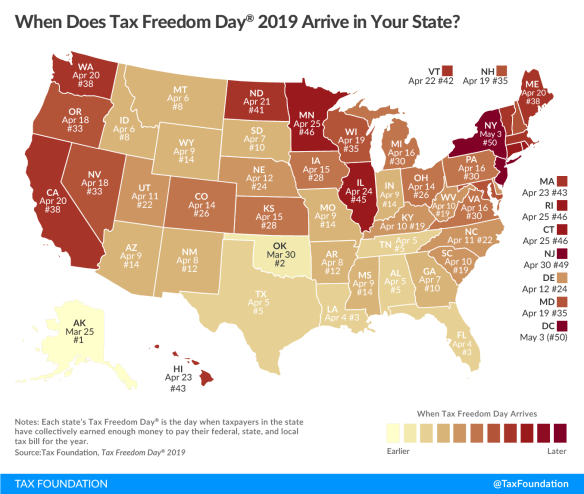
Tax Freedom Day 2019
Ah taxes! In case you have not been paying attention, they are due today!
This year Tax Freedom Day is April 16th, 105 days into the year. What is Tax Freedom Day? It represents how long Americans as a whole have to work in order to pay the nation’s tax burden. Think of it as the number of days each year you work for the feds, state, and city to pay them off! For California, Tax Freedom Day comes April 20! Click below for more info on this interesting topic!
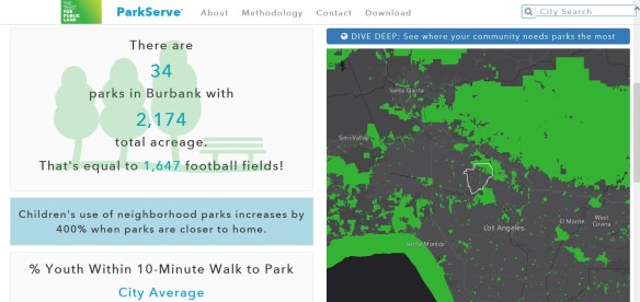
Parks Near You
Top 5 Rivers of Plastic
Check out this retro looking map showing the top five most plastic polluting rivers in the world. The map uses stacks of Asian Elephants (about 4 tonnes each) to represent daily amounts of plastic. Descriptive text is included so you don’t have to count elephants!
Spoiler alert, no high output rivers from the US. Stop focusing on those straws California!
You can find out more about the map from here. Also there is a story map you can check out. Map is based on data from a study you can find here.
ArcGIS Excalibur 1.0
Ever heard of ArcGIS Excalibur? I have not. Apparently it is a new web-based application that allows you to work with imagery layers in your web GIS, providing you tools and capabilities for streamlining image and geospatial analysis. It is a premium web application available as part of ArcGIS Enterprise 10.7. Continue reading
Switching to ArcGIS Pro from ArcMap
ESRI Press recently released a new book titled “Switching to ArcGIS Pro from ArcMap”. I decided to check it out and let you all know about it.

The book is in 8×10 size format and is rather skinny, only 3/8 inches thick. Some of you might call this a pamphlet, not a book. There are 172 pages in color. ESRI will charge you $50 if you buy it from them. Amazon about $31 for the book and $28 for Kindle version.
The author of the book is Maribeth Price, Professor of Geology and Dean of Graduate Education for the South Dakota School of Mines and Technology. She teaches college GIS courses and has written textbooks using ESRI software.
If you need to learn GIS, this is not the book for you. The book was written for seasoned ArcMap users who understand the GIS terminology, data structures, and procedures when using ArcGIS software. The book focuses on how ArcGIS Pro is different from ArcMap and quickly tries to enable someone to make the transition to Pro. The book leverages a user’s ArcMap knowledge to help them learn ArcGIS Pro quickly and efficiently.
The book assumes the user has a license for ArcGIS Pro, though it does come with an eval code on the inside back cover for a 180-day trial license which you can get through the book’s resource page. An organizational account for ArcGIS Online is recommended, however the first few exercises can be used with an ArcGIS Online public account. Data comes with the book for the exercises and can be downloaded from the book’s resource page.
The book is organized into 11 chapters, which you can look at here. As you can see, the book takes you through the GUI, working with a project, 2D and 3D navigation, symbolizing features, labeling, geoprocessing, joining and relating tables, creating layouts, managing data, and editing data … all the basics to get you up to speed using Pro. The exercises in each chapter help users become accustomed to the new interface and get hands-on experience using the tools and workflows in Pro. You can take a look at a sample chapter here.
The book is good for someone like me who has been using ArcMap since version 8! I hate the ribbon interface that Pro uses, just like other Microsoft Windows products like Word and Excel, I find it very hard to find what I am looking for. However, I understand why ESRI went this way, trying to keep the user experience the same with a similar GUI. The GUI is highly context sensitive, meaning that it changes on the basis of what you are currently doing, thus making the relevant tools more accessible, but again can be very confusing because commands and tools do not stay put … but I digress.
Each chapter has opening text that explains the concepts and tasks you are about to do in the exercises. Then in the “Time to explore” section, the exercises, or “objectives”, are easy to follow with step by step instructions.
I like the format of the book. I find the portions of the interface you are exposed to rather limited and basic, but that is what this book is about, to get the ArcMap user up to speed with common GIS and mapping tasks in Pro. A deeper dive you can do with the ArcGIS Pro Help or even try out some other books like Getting to Know ArcGIS Pro or even going through a single project from start to finish in Understanding GIS An ArcGIS Pro Project Workbook.
The book does tackle the question “When should I switch?”. Some examples of delaying switching over to Pro include:
- The organization does not have enough computers capable of running Pro
- Some critical functionality may not yet be available in Pro
- Your organization has custom scripts or tools that must be updated to run in Pro
- Third party extensions might not run in Pro
- Pro does not recognize personal geodatabases and ArcInfo coverages
- The Excel interpreter is different and seems less forgiving than the one in ArcMap
- The annotation editing tools in Pro are still catching up to ArcMap
But do not wait too long, for ArcMap’s days are numbered.
If you are looking for a basic good book to help you with migrating from ArcMap to Pro, this is worth getting a copy. -mike
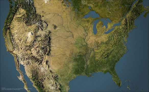
Smash Vintage Hillshade into Modern Imagery
Robocalls
Mad about robocalls? It seems to be increasing on my cell phone every year. In 2018, a record 48 billion robocalls were placed to phones in the US. That works out to 1,500 robocalls per second! Check out this map on robocalls and read the Consumer Reports article about it and how you can start the wave to stop it.


