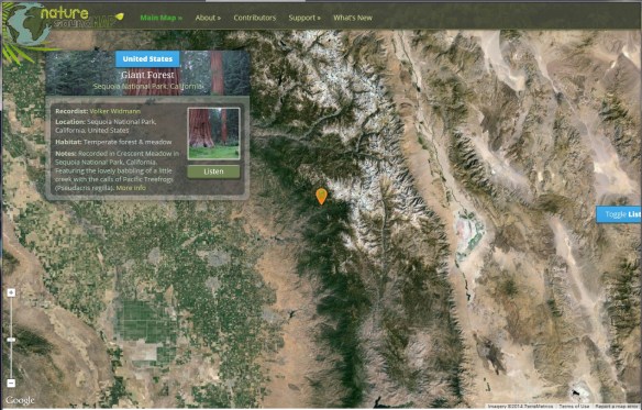
What does a humpback whale sound like? Or perhaps the White-cheeked Gibbon? The Nature Soundmap provides snippets of these sounds and much, much more. Visitors will find an interactive map of the world, complete with markers that allow audio wildlife travel from Central America to Central Asia. Symphonies of animal noises can also be found here. Each marker includes information about the animal or setting profiled, along with a link to More Info for the generally curious. Click below to check it out.
Category Archives: Maps/Apps/Charts/Data
Disasters in the Golden State
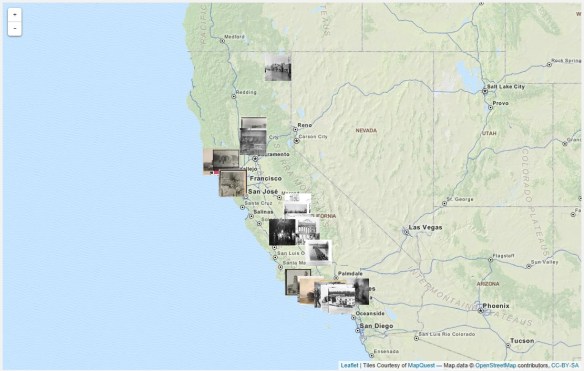
The talented archivists at Calisphere have curated a range of subjects on California history as part of their Local History Mapped series. This particular feature takes on Disasters in the Golden State by looking into the way disasters have affected buildings during the 19th and early 20th centuries. It’s a great subject and visitors can use the View Map feature to explore the state.
The homepage provides a brief synopsis of each major disaster type, along with resources for teachers, including class activities based on thematic collections of these images. Additionally the site includes a helpful document titled “How to Use Local History Mapped” and some complementary links from the Joint Committee on Geographic Education.
That reminds me of this book:
It’s very interesting with first hand accounts of California disasters from 1800 to 1900.
Government: Use Your Own Data!
Here is a small but very good example why government should be using their own authoritative data and not depend of Google or Bing! Too many times I hear “just use Google maps, why should we spend money developing our own data, maps, and apps”.
LA County GIS is constantly setting the bar on developing great data and apps, using it, and sharing too! -mike
ArcGIS Pro … Soon
During the 2013 ESRI User Conference in San Diego, ESRI demonstrated what they called ArcGIS Professional. It was still under development at the time, but they said it was slated for a Q4 2013 release. That did not happen, though maybe it was for beta testing sites? Not sure.
Now they are saying it will be part of the ArcGIS 10.3 release planned for the second half of 2014. If you have not seen it yet, below is a video from the ESRI Federal GIS Conference in February 2014.
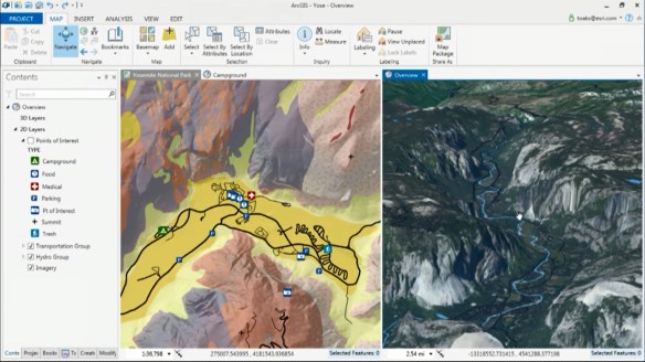
ArcGIS Pro has a ribbon interface that would be similar to Microsoft Excel and Word products. I personally don’t like that type of interface, the functionality gets lost to me. Others might find it natural though.
ArcGIS Pro is a 64-bit multi-threaded application that is designed to be the premier application for visualizing, editing, and performing analysis using your local content or content from your ArcGIS Online account or Portal for ArcGIS. You can author content in both 2D and 3D and publish it as feature, map, and analysis services, 3D web scenes, and web maps.
ESRI states that ArcGIS Pro will not replace ArcGIS for Desktop. Prediction: I give them 3 years before Desktop goes to live with ArcView 3.
The initial release will not have all the functionality that ArcGIS for Desktop has, but Pro will have capabilities that Desktop does not right now:
- Project based workflows
- Combined 2D/3D visualization
- 64-bit support
- Multiple layout support
Map documents (.mxd), scenes (.sxd), and globes (.3dd) can be imported into ArcGIS Pro and saved as projects (.aprx). WHAT? Having ArcView 3 flashbacks?!!!
ESRI did state that projects are not backward compatible so you cannot go back to ArcMap. But keep in mind the geodatabases you use in Pro will also be accessible by ArcMap so there can be collaboration at the data level. Services published with Pro can be shared with ArcMap. Also, both can run side by side on the same machine.
ArcGIS Pro is part of ArcGIS for Desktop, so only ArcGIS for Desktop customers will be able to receive ArcGIS Pro. ArcGIS Pro will come in three licensing versions that correspond to Desktop license levels Basic, Standard, and Advanced. Also, the initial release of Pro will be able to work with the following Desktop extensions: 3D Analyst, Spatial Analyst, Network Analyst, Workflow Manager, and Data Reviewer.
ArcGIS Pro will run on Windows 7 or 8 on a 64-bit machine. 8GB of RAM or more is recommended.
There is no doubt that ArcGIS Pro will be featured at the ESRI Conference in San Diego this year! Looking forward to it. -mike
Pacific Region Geospatial Data Announcements
From Drew Decker at USGS:
- National Hydrography Dataset (NHD) releases Web HEM Tool. HEM stands for Hydrography Event Management and is a tool developed to help relate users’ data to the NHD network as events. Please see announcement on pages 4 and 5 in the latest NHD Newsletter here: http://nhd.usgs.gov/newsletters/News_13_6_April.pdf
- New urban imagery is now available for a number of California cities. The datasets are natural color and have a one foot resolution. The data cover the Fresno, Modesto, Oxnard, Stockton, and Sacramento urban areas. Data can be downloaded through the EarthExplorer site: earthexplorer.usgs.gov (all cities) and The National Map Viewer site: nationalmap.gov/viewer (all except Modesto).
- U.S. Fish and Wildlife Service announces completion of National Wetlands Database and Interactive Mapping Tool. See: http://www.fws.gov/news/ShowNews.cfm?ID=B8C3A940-E396-7509-F23601BB03228754
- For anyone wishing to track the status of CA NAIP collection currently in progress, look here: http://gis.apfo.usda.gov/naipstatus14/
- USTopo maps go into production for CA and NV in December, 2014. Please consider validating structure points (hospitals, post offices, schools, etc.) through our National Map Corps program. Watch for upcoming webinars. https://my.usgs.gov/confluence/display/nationalmapcorps/Home
MapStory Webinar Opportunity
If you are interested, you are invited to the seventh webinar of the “Open Geospatial Science & Applications” webinar series on May 15th, 2014. The webinar will be open and free to all on first come register basis.
This webinar will be on MapStory, the Atlas of Change that everyone can edit. MapStory is a place to unify and improve our shared knowledge about global change. Mapstory envision a world where everyone’s wisdom can be tapped, peer reviewed and organised into a non-commercial global data commons that helps us all improve our understanding of global dynamics, worldwide, over the course of history. Details at http://mapstory.org .
This presentation will be by Dr. Christopher Tucker and is about the MapStory Foundation’s investment in the open source GeoNode, its use to enable crowdsourcing of open spatio-temporal data, and how people can use it to tell their stories to a global audience. He will be talking about the GeoGit/GeoNode integration that is happening this Summer and how that will open participation widely to users who have as little as a single edit to contribute.
Attendees will be able to interact with the speakers by sending their comments and questions through chat. All attendees of this web seminar will receive certificates for their participation. To register visit https://www2.gotomeeting.com/register/922723730 .
The recording will be made available also later for the benefit of the wider community at http://mundogeo.com/webinar/opengeoscienceandapplications/ .
Spy Satellite Images Unveil Lost Cities
The Program
During the cold war, there was a spy satellite program called Corona. The Corona program was a series of American strategic reconnaissance satellites produced and operated by the Central Intelligence Agency Directorate of Science & Technology with substantial assistance from the US Air Force. The Corona satellites were used for photographic surveillance of the Soviet Union (USSR), the People’s Republic of China, and other areas beginning in June 1959 and ending in May 1972. The name “Corona” was a code name, not an acronym.
The Technology Behind the Photos
During the program, there were 144 satellites launched, of which 102 returned usable photographs. The satellites orbited at altitudes of 100 miles above the Earth, with later missions orbiting even lower at 75 miles.

The satellites used special 70mm film with a 24 inch focal length camera manufactured by Eastman Kodak. The film was 0.0003 inches thick, with a resolution of 170 lines per 0.04 inches of film. The amount of film carried by the satellites varied from 8,000 feet for each camera to 16,000 feet. Most of the film shot was black and white.
So how did we get the film back? This is the cool part! The film was retrieved from orbit via a reentry capsule (nicknamed “film bucket“). Exposed film would be stored in the capsule, and when ready would then be ejected from the satellite to fall to earth. After the fierce heat of reentry was over, the heat shield surrounding the capsule was jettisoned at 60,000 feet and parachutes were deployed to slow the rate of descent. The capsule was then caught in mid-air by a passing airplane towing an airborne claw which would then winch it aboard!

The capsules were also designed for landing in the ocean. A salt plug in the base would dissolve after two days, allowing the capsule to sink if it was not picked up by the US Navy. On occasion the capsules landed by accident on land, which prompted the removal of the word “Secret” stamped on the capsule and replaced with words in eight languages offering a reward for their return to the United States. Hmm … I wonder if that worked? The film was processed at Eastman Kodak’s Hawkeye facility in Rochester, New York.
Here is a video about the Corona program. And here is an old calibration target used by the Corona satellites near Casa Grande, Arizona.
The Images
In 1995, President Clinton declassified 800,000 photographs from the Corona project in order to make them available for environmental and historical research. Archaeologists working in the Near East have been quick to embrace this newly available resource, which capture images of sites and landscapes in the 1960’s. Research into ancient landscapes at Harvard has used these images to investigate the communication networks of the Early Bronze Age, state-sponsored irrigation under the Assyrian and Sasanian empires, and pastoral nomadic landscapes in northwestern Iran and southeastern Turkey.
For archaeology, Corona photographs have two tremendous advantages over other space-based imagery sources. Many rural parts of the Near East have escaped agricultural development and urban growth until recent decades, when many have been damaged or destroyed. Corona photographs predate this destructive development and thus preserve a record of landscapes that are difficult or impossible to map on the ground. Corona images were made before cities such as Mosul in Iraq and Amman in Jordan overran the many archaeological sites near them. Dams have also flooded river valleys, covering many other archaeological sites. As cities grew, the industrial farming and irrigation that supported them grew too, obscuring roads and sites clearly visible in the Corona images. More recent commercial sensors such as Ikonos and QuickBird have a higher resolution, but they capture the modern damaged landscape of today.
Corona photographs are also of high resolution, capable of displaying features as small as 2 meters in ideal conditions. Many features visible in Corona cannot be seen in medium resolution satellites such as Landsat (30 m) or ASTER (15 m).
Recently, a team from Arkansas’s Center for Advanced Spatial Technologies have built a free, public tool to explore the Corona images of the Middle East.
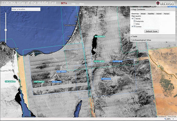
The team plans on adding more images from Corona, such as areas of Russia and China.
Mapping Millions of Runs and Rides
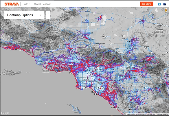
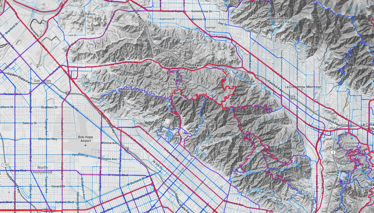
Strava, which provides an app for you to track your rides and runs via your iPhone, Android or dedicated GPS device, has released an interactive global heat map showing logs of 77,688,848 rides and 19,660,163 runs. The heat map draws from about 220 billion data points and provides a detailed picture of where people bike and run. Below is the LA area, but you can zoom out to view the world.
Popular routes are in red, moderate in dark blue, and less traveled in light blue. You can view biking or running separately or together, change the path opacity, and also change the heat map style.
If you are a planner looking to establish new bike paths and trails, this information could be gold for you!
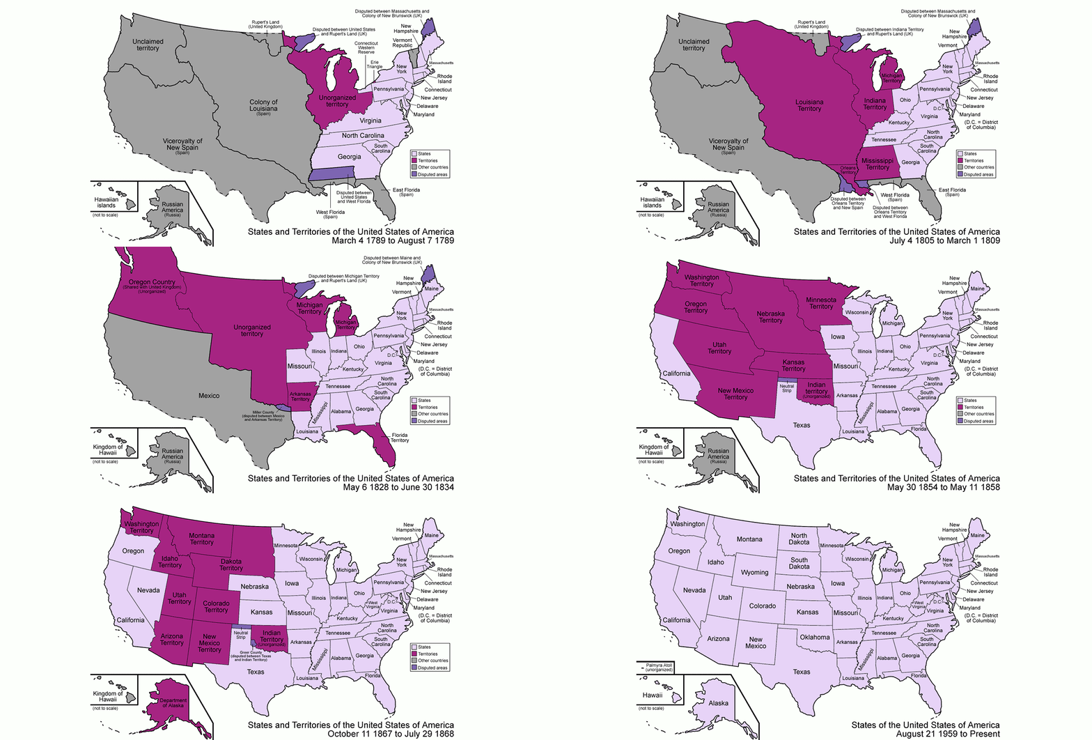
Territorial Evolution of the United States
I found this interesting animated image showing the evolution of the borders of the United States. Click on it to view larger.
For more information about the history of our state borders, see this site. Or even better, check out this book. It was a great read, very interesting.
Or, you can watch the videos here!
Port of LA/Long Beach on Skybox
I noticed on the home page of Skybox Imaging’s site, they feature images of a portion of Port of LA and Port of Long Beach. The demo zooms to different locations and explores the imagery data.
Also check out one of their satellite HD Videos of Burj Khalifa on April 9, 2014. The shadow of the world’s tallest building (more than half a mile high) is most impressive! I also like the jet that flys by and the traffic moving on the highway.
Very cool! You can view it larger here. And more of their videos here.