LA’s Electrical Use

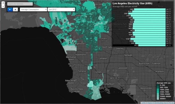
Researchers at UCLA have put together an interactive map showing electrical use in the City of Los Angeles neighborhoods.  The data is organized by block group and shows the average amount of electricity used per customer for each month over a one and a half year peroid, how that compares to other neighborhoods, and how energy use has changed over the study period.

You can hover over block groups on the map to see electricity usage (kWh) over time, switch between average use per month and percent change from one month to the next, zoom in and click to show land use, income, and other characteristics, and animate the usage over time.

The app is best viewed in Chrome, Firefox, and Safari … sorry Internet Explorer!
la_electric_use

EPA Map of California Tracks Pollution

The California Environmental Protection Agency has released a statewide list of census tracts most burdened by pollution. Many of the worst pollution pockets identified are in the San Joaquin Valley, Los Angeles County and the Inland Empire.

The screening tool, called CalEnviroScreen, was developed by the Office of Environmental Health Hazard Assessment, a branch of Cal/EPA, to pinpoint the communities with the highest exposure and vulnerability to multiple environmental hazards, including polluted air and water, waste facilities and contaminated soil.  The rankings, however, are not based only on measures of environmental exposure. They also take into account socioeconomic characteristics and health data on residents to assess the overall vulnerability of communities. Those factors include poverty, education, unemployment, rates of asthma and low-birth-weight infants.

You can read more about it in this LA Times article.

epapolutionapp

As a side note, I find the CalEPA app a little slow in Internet Explorer.  Google Chrome was a little faster.  They are using ArcGIS Online technology for their mapping.  If you do a search for “calenviroscreen” on ArcGIS.com, you will see a listing of their maps and apps for versions 1.1 and 2.0.

Tax Freedom Day 2014

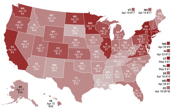
In the spirit of April 15th, tax day in the US, remember Tax Freedom Day too.  This year Tax Freedom Day falls on April 21st, three days later than last year.

Tax Freedom Day is the day when the nation as a whole has earned enough money to pay its total tax bill for the year.  We all work over 3 months for the government each year!  Click below to see a calendar-based illustration and map of the cost of government.

taxfreedomday

In California, our Tax Freedom Day falls on April 30th.  California ranks #4.

1932 Atlas of the Historical Geography of the US

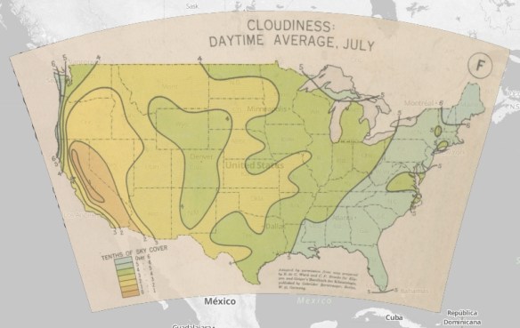
In 1932, Charles O. Paullin and John K. Wright published an Atlas of the Historical Geography of the United States. It was a seminal reference book, containing almost 700 maps, and now it’s been digitized for you to explore online.  It is full of fascinating data, mapped across the US, from weather, travel, population, to gold reserves, oil fields, and vegetation types.  It’s been painstakingly transcribed into digital format, which you can view georectified or as scanned plates.  Check it out!

1932atlas

National Land Cover Database

Just released, the latest edition of the nation’s most comprehensive look at land-surface conditions from coast to coast shows the extent of land cover types from forests to urban areas. The National Land Cover Database (NLCD 2011) is made available to the public by the U.S. Geological Survey and partners.

Dividing the lower 48 states into 9 billion geographic cells, the massive database provides consistent information about land conditions at regional to nationwide scales. Collected in repeated five-year cycles, NLCD data is used by resource managers and decision-makers to conduct ecosystem studies, determine spatial patterns of biodiversity, trace indications of climate change, and develop best practices in land management. Click below to check it out.

How Big is a Big Map?

Stanford University Libraries digitized William Smith’s Stratified Map of England, Scotland and Wales from 1815.  It is part of an ongoing project to digitize thier “large map” holdings. Although the main section of the map is split into 15 pieces, when assembled, it measures approximately 8′ x 6′.  The digital version is made up of 253 shots and is the largest item they have digitized so far. A high resolution composite of all parts would yield an image file approximately 12Gb in size.

Resources of the National Geophysical Data Center

A live training Webinar, “Resources of the National Geophysical Data Center,” will be offered on Wednesday, April 23, 2014.

Register today for “Resources of the National Geophysical Data Center.”

Start Time: 2 p.m. Eastern Time
Duration: 60 minutes
Speaker: Dan Kowal, Data Administrator at the National Geophysical Data Center
Summary: Dan will provide a background of one of NOAA’s three data archives that specializes in the scientific data stewardship of geophysical data that spans the surface of the sun to bottom of the seafloor. He will give an overview of the types of services available from the Data Center.
Learning Objectives: Participants will learn about the breadth of data disciplines covered by NGDC and the access tools available to query and retrieve data.

Registration is required. Space is limited on a first-come, first-served basis. Upon registering, an e-mail confirmation of registration will include instructions for joining the Webinar.

Registration confirmations for the Webinar will be sent from sqldba@icohere.com. To ensure delivery of registration confirmations, registrants should configure junk mail or spam filter(s) to permit messages from that email address.

FDLP News & Events is a service of the Federal Depository Library Program.