Get into the Holiday spirit and make a Cassini globe ornament. Check out the ESRI blog post below.
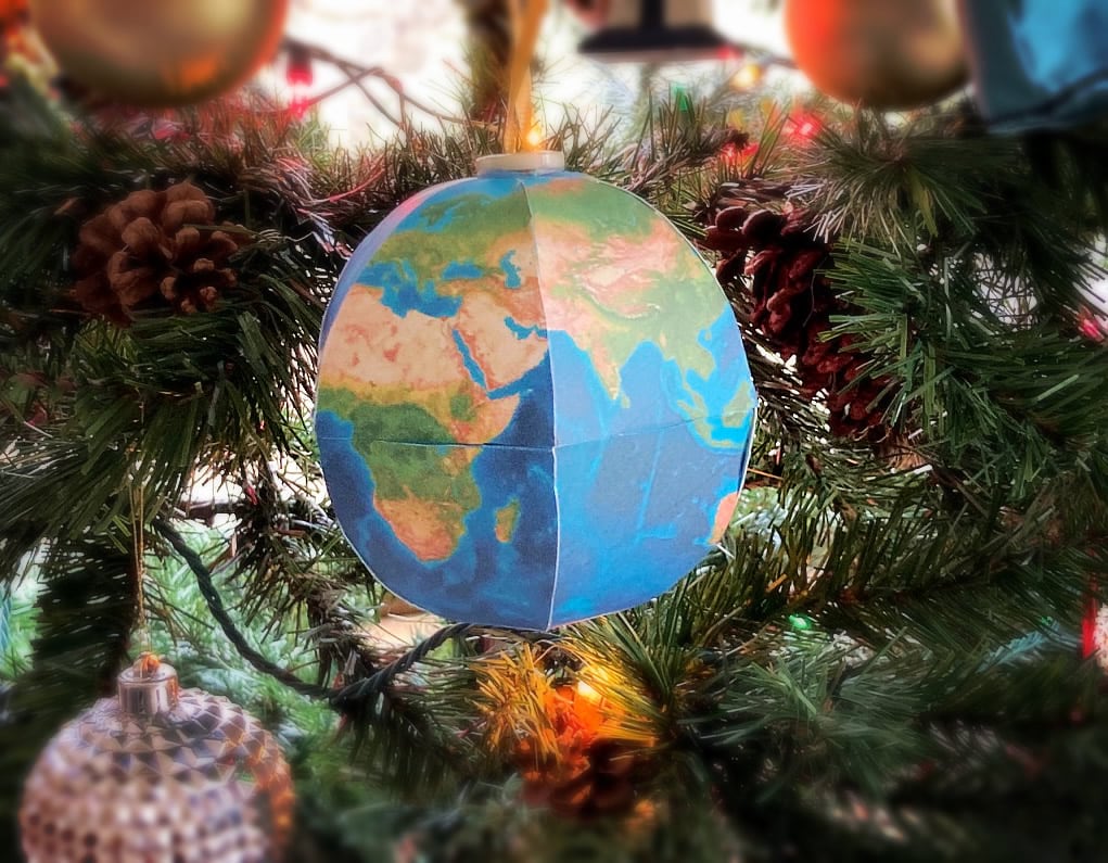

Get into the Holiday spirit and make a Cassini globe ornament. Check out the ESRI blog post below.
This FREE crash course (tutorial) will teach you a basic understanding of how to use and interpret historical aerial photographs (air photos).
This tutorial is designed to be used by adults including undergraduate students. The tutorial is a serious endeavor created to teach you something; it is not a site for pretty pictures.
The tutorial is broken into 2 parts — introductory text and quizzes. The introductory text can be completed in approximately 30 minutes. The quizzes are skill-building exercises and can be completed in 30 to 45 minutes.
In this tutorial you will learn:
Start learning about air photos! https://mines.libwizard.com/f/airphotos_2
Think you already know a lot about aerial photographs?
Go directly to the quizzes! https://mines.libwizard.com/f/airphotos_2/p/21
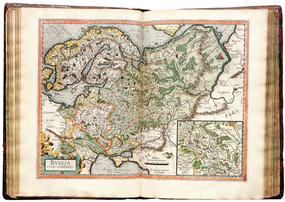
Geographical maps are a mirror of what we know about the world around us. Few individuals contributed more to the map making field than cartographer Gerardus Mercator. Check out this site that examines Mercator’s map making breakthroughs and mistakes, while also recognizing his lasting legacy. We still use Mercator’s projection for making nautical and aeronautical charts!
Since this is Election Day, I thought I would find something on election maps and cartography. I found this article from the New York Times. Politics aside, they do show how you can make a better election map using cartographic and color techniques. Check it out!

Also check out this interesting historical map at the Library of Congress on Presidential Elections from Washington (1789) up to Hayes (1876). Some of the history of the elections on the map are very interesting:
“Disputes arising in February, over the votes of South Carolina, Florida, Louisiana and Oregon, they were referred to, and decided by a Commission appointed for that purpose.”
“The votes of Arkansas and Louisiana were not counted in February, on account of irregularities.”
“Objections made to Wisconsin’s vote in February, were overruled by the Vice-President.”
Click below to see the map in detail.

Since wind is the topic today through tomorrow in SoCal, check out the Windfinder interactive map. You can move forward and backward in time to see what is forecast for wind in your area.

Have a favorite wind app? Post a comment so others can check it out.
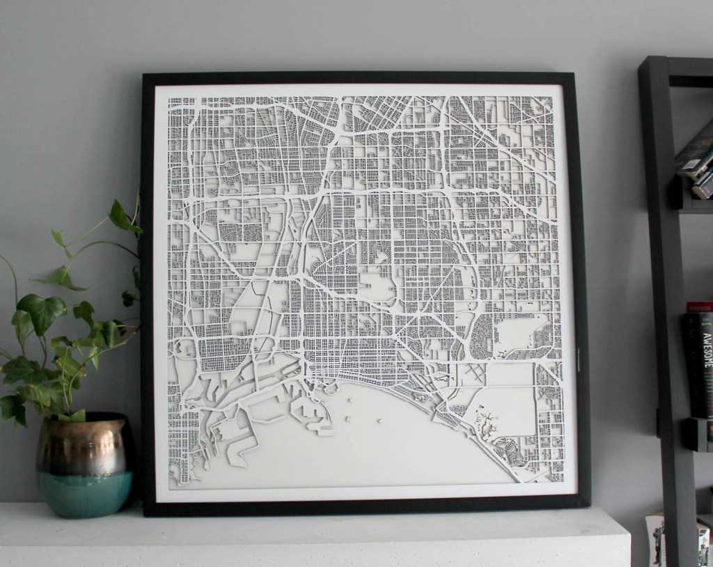
It might be a good idea to start Christmas shopping early this year. For your map maniac, how about a Street Carvings map, 3 layers of precision cut wood using a 100 watt laser. Check it out!
Check out this world map made out of recycled wool!

Here is a cool video of a year through the distant eyes of meteorological satellite Himawari-8, from December 21, 2015 to December 21, 2016. The satellite observes Earth in geostationary orbit at 140.7 degrees East following Earth’s rotation by travelling at approximately 11068 km per hour at a distance from Earth at 35768 km. Check it out and look for the March 9, 2016 total solar eclipse!
According to Google Maps Help, there is a COVID-19 layer that you can turn on in the Google Maps app on your phone. It displays the 7 day average for the number of new cases per 100,000 people. It also indicates whether cases are increasing or decreasing. More info on the Google blog.
I updated Google Maps on my phone, but it was not there in the layer list. I found this on a Google Maps Help page that new features are rolled out in stages and you might not get it right away. Perhaps it is working for you? Add a comment if you got it to work along with type of cell phone and carrier you have.
UPDATE 9/29/2020 – The COVID-19 layer magically appeared in Google Maps on my Android phone. Looks like the info is at the county level.
Check out this article about how a globemaker at Replogle Globes keeps globes up to date and keeps certain countries happy with what they want to see on their globes.


