A Better Election Map

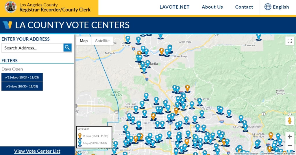
Since this is Election Day, I thought I would find something on election maps and cartography. I found this article from the New York Times. Politics aside, they do show how you can make a better election map using cartographic and color techniques. Check it out!

Also check out this interesting historical map at the Library of Congress on Presidential Elections from Washington (1789) up to Hayes (1876). Some of the history of the elections on the map are very interesting:

“Disputes arising in February, over the votes of South Carolina, Florida, Louisiana and Oregon, they were referred to, and decided by a Commission appointed for that purpose.”

“The votes of Arkansas and Louisiana were not counted in February, on account of irregularities.”

“Objections made to Wisconsin’s vote in February, were overruled by the Vice-President.”

Click below to see the map in detail.

The Seeger Map Company Closing

The Seeger Map Company in Wisconsin will be closing the business by the end of 2020. The first Seeger maps were those drawn for motel guests on scraps of paper in the late 1960s. Eventually, the company would distribute 2 million maps a year, including AAA maps, and employ 27 people in their Racine, Wisconsin offices. Click below to read more about it.

You can still order maps and atlases from their website here.

ArcGIS Survey123 Enhancements

If you use Survey123 in your organization, a new update is now available. With this release, Survey123 Connect and the Survey123 web designer will help you create more powerful forms, including ranking questions, choice randomization, and choice filters. You will also be able to more easily create Survey123 report templates. Click below for more info.

Outside Demo of Wingtra Drone

Looking to get outside for a few hours? Join us at a large area to social distance and watch Wingtra demonstrate the fixed wing vertical takeoff mapping drone starting at 10am Thursday October 15th above the San Antonio Dam, just 5 minutes from the Baseline offramp to the 210 freeway. Masks required.

Here is the 3 meter square location: https://what3words.com/unplanned.kings.nationals

And also let us know here so we can give any last minute updates if necessary: https://tinyurl.com/y48assbf

Hope to see you there!

Prof Warren Roberts
Rio Hondo College

COVID-19 Layer in Google Maps

According to Google Maps Help, there is a COVID-19 layer that you can turn on in the Google Maps app on your phone. It displays the 7 day average for the number of new cases per 100,000 people. It also indicates whether cases are increasing or decreasing. More info on the Google blog.

I updated Google Maps on my phone, but it was not there in the layer list. I found this on a Google Maps Help page that new features are rolled out in stages and you might not get it right away. Perhaps it is working for you? Add a comment if you got it to work along with type of cell phone and carrier you have.

UPDATE 9/29/2020 – The COVID-19 layer magically appeared in Google Maps on my Android phone. Looks like the info is at the county level.

ArcGIS Notebooks Webinar

Need to automate data prep and aggregation? ArcGIS Notebooks might be your ticket! Sign up for a 60-minute webinar by ESRI’s spatial data science experts as they walk through how you can leverage the latest updates to ArcGIS Notebooks along with popular open source frameworks to automate, data prep and aggregate for a variety of workflows. The webinar is on September 30, 2020 at 9am PDT. Click here to register.

This webinar is an intermediate level session and serves as a follow up session to the previous recorded webinar, “How to use ArcGIS and Jupyter for Geospatial Data Science.” Watch the recording to learn about the fundamentals of ArcGIS Notebooks, data engineering concepts and more, prior to this session.