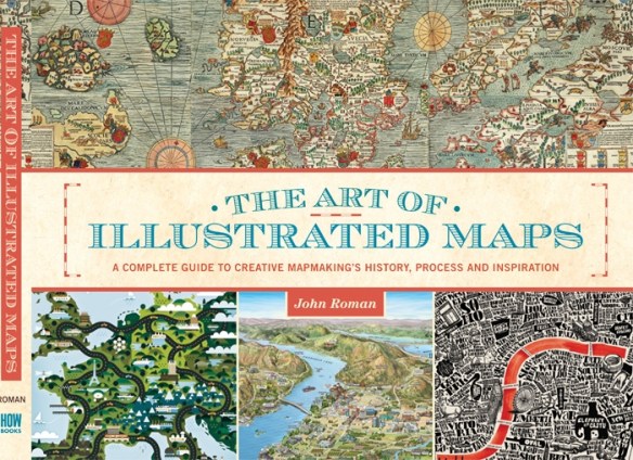
If you are interested in illustrated conceptual maps, want to learn more about creative cartography, or want to see examples from illustrators around the world, The Art of Illustrated Maps by John Roman might be interesting to you. This is the first book ever to fully explore the fascinating world of illustrated conceptual maps. Check it out!
Category Archives: Maps/Apps/Charts/Data
Columbus Day Map
Happy Columbus Day to you, and a map too!
You also might find interesting the Top 5 Misconceptions About Columbus.
ODOT Workaround for FILESTREAM and Collector
Do you use SQL Server and are thinking about using Collector to store potentially large amounts and data and pictures? Check out this article. Experts from the Ohio Department of Transportation provide a detailed workflow example, with step by step instruction, for using FILESTREAM with Collector for ArcGIS to gather, manage and store extremely large datasets in the best ways possible for performance, management and scalability, in line with current industry best practices.
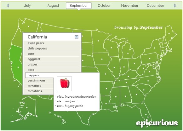
Seasonal Ingredient Map
Urban Heat Islands in California
The California Environmental Protection Agency released a study that identifies areas across California experiencing hotter summer temperatures as a byproduct of urban development.
Urban areas have higher temperatures during summer compared with adjacent rural communities, a phenomenon known as the urban heat island. Heat islands are created by a combination of dark pavement and roofs that absorb heat, heat-generating activities such as engines and generators, and the absence of vegetation that provides evaporative cooling.
While the phenomenon is well-known, the study for the first time creates an Urban Heat Island Index (UHII) to quantify the extent and severity of the heat island effect for individual cities throughout the state. The study found temperature increases ranging from a few degrees in small cities and coastal areas to as much as 19 degrees on average over a day in large, inland urban areas.
Click below to read the report on how the Urban Heat Island Index was created and view the maps and data for different urban areas.
What is Your Oktoberfest Score?
Are you ready for beer? Fall means Oktoberfest celebrations around the globe, and ESRI has created the Oktoberfest Score app that ranks your community against others in the US. The app uses demographic, consumer spending, and market potential data and lets you explore beer consumption in your area and discover other communities with similar tastes. Prost!
Red Cross Western States Wildfires Map
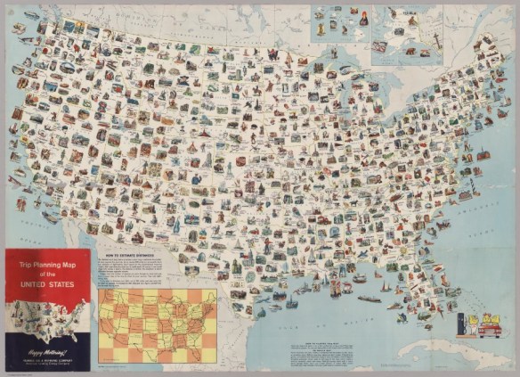
Trip Planning Map 1962
Ready for an epic road trip? Visit every place on this 1962 trip planning map. This map has it all. Originally produced by General Drafting Company, it was one of many produced for oil and gas companies that either freely distributed or sold maps at their service stations.
California Sinking Faster Than Thought
A new NASA satellite image shows that California is sinking even faster than scientists had thought.
Some areas of the central valley are sinking more than 2 inches per month. The rate of sinking is accelerating because the state’s extreme drought is fueling voracious groundwater pumping. Click below for the story.