Check out this 1915 perspective map of Los Angeles and the San Gabriel Mountains, created by the Automobile Club of Southern California.
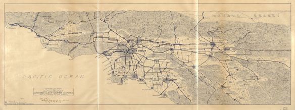
You can see some town names that do not exist anymore, like Savannah and Lordsburg.

Check out this 1915 perspective map of Los Angeles and the San Gabriel Mountains, created by the Automobile Club of Southern California.
You can see some town names that do not exist anymore, like Savannah and Lordsburg.
Check out this Library of Congress post about the “father of temperature mapping”, Alexander von Humboldt (1769-1859), who devised the concept of the isotherm. Cool maps!

Working on a choropleth map? Check out this article about when to use them and when not to, how to make them better, and some examples of good ones.

Also read this companion article (click below) about how different patterns become visible depending on the area unit you choose.

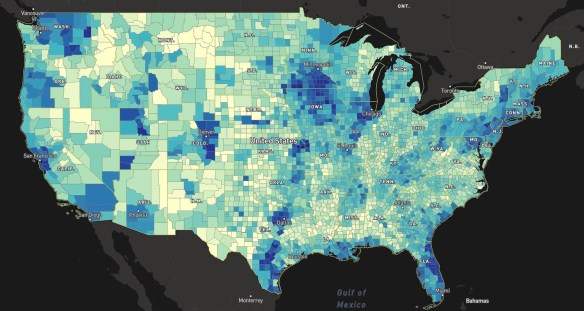
While helping out someone that was looking for fatal accident data, I ran across a cool map service hosted by the US DOT Bureau of Transportation Statistics. Looking at the REST endpoint for their map services, I found the National Transportation Noise Map. The service description reads:
The National Transportation Noise Map is developed using a 24-hr equivalent sound level (LEQ, denoted by LAeq) noise metric. The results are A-weighted noise levels that represent the approximate average noise energy due to transportation noise sources over the 24 hour period at the defined receptors. This map includes simplified noise modeling and is intended for the tracking of trends, it should not be used to evaluate noise levels in individual locations and/or at specific times. https://maps.bts.dot.gov/noise/
If you click on the link in the description, it will take you to a document that outlines how the noise levels were collected and processed. A few points about the data:
Adding the image service to ArcMap displayed this in the LA basin area:
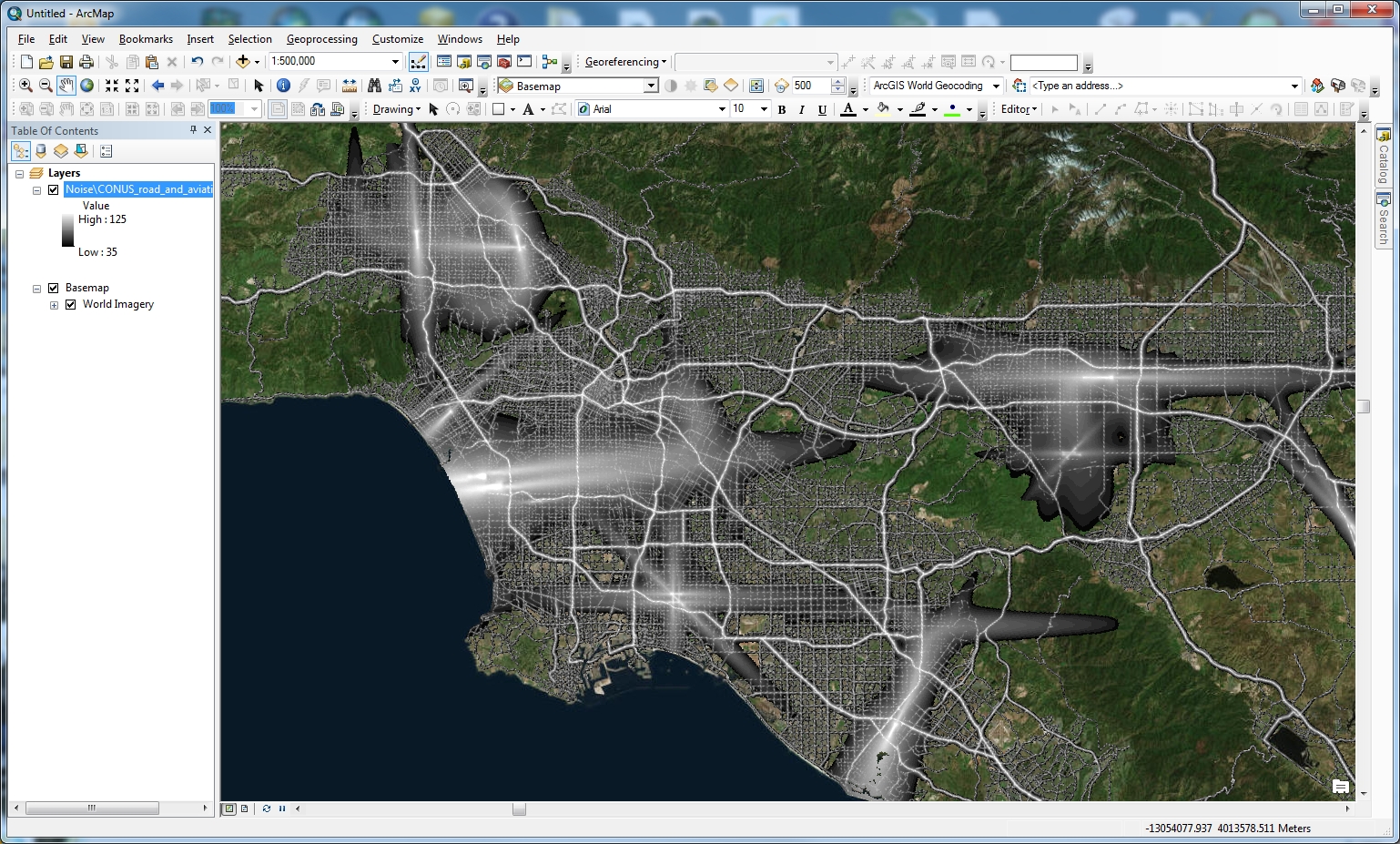
I then changed the color ramp so high noise levels were red and low noise levels were blue.

Pretty cool … unless you live near LAX!
Who does your taxes? H&R Block? TurboTax? A CPA/Tax Professional? Yourself? Check out this web map by ESRI. ESRI says it used data at the census tract and block group level. It looked at whether taxpayers used H&R Block, TurboTax, a certified public accountant or other tax professional, or did their taxes on their own. ESRI then credited that block to which ever method was used the most. Click on a point and get the breakdown of tax methods.

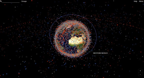
January 2023 NOTE: The Stuff in Space website has moved. The link to the site has been updated.
Stuff in Space is a “real-time 3D map of objects in earth’s orbit”, including satellites and debris. This map uses data from Space-Track.org, a website operated by the U.S. Department of Defense. On this map, different kinds of “stuff in space” are color-coded: red for satellites, blue for rocket bodies, and grey for debris. Visitors may also explore different groups of space objects, which include maps of all Global Positioning System (GPS) satellites and their orbits and a map of the debris created by the 2009 collision of the satellites Iridium 33 and Kosmos 2251. Check it out!
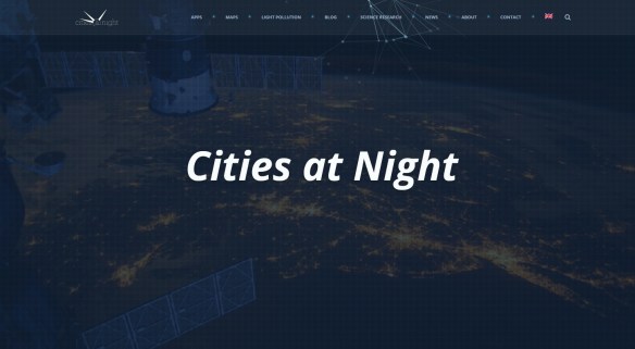
Astronauts on board the International Space Station (ISS) take hundreds of night-time pictures each year of cities around the globe. Cities at Night is a “citizen science project that aims to create a map, similar to Google maps, of the Earth at night using night-time color photographs taken by astronauts onboard the ISS.” Check out the photographs that have been geo-referenced to the Earth, or join in and help the project team geo-reference new photographs!
In February the FCC released their new broadband map showing the availability of high-speed internet in the US. Many of you might remember their previous map which turned out to be completely useless. Well … this new one seems to be about the same, not matching the reality on the ground. Click below to read more about the story.
A great example of how to lie with maps. Hey! There’s a book about that! You should get it, it’s a great book.
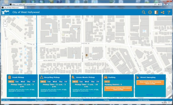
The City of West Hollywood’s Curbside Services web-app provides information about curbside services, such as waste management, street cleaning, and permit parking areas. Just enter a West Hollywood address or click on the map. Check it out!
Starting April 11, 2018, ESRI will update their Landsat Image Services. Improvements include revised scaling of Top of Atmosphere (TOA) reflectance values, daily updates, new QA band, a new field to keep track of Landsat product ID, and WCS/WMS compatibility. For more info visit ESRI’s blog posting here.
