From NFL Memes, who America is rooting for in the Super Bowl:


From NFL Memes, who America is rooting for in the Super Bowl:
The product of 400 different railroads, Burlington Northern Santa Fe (BNSF) is using GIS to convert all their paper maps collected over 170 years into digital information. Click below to read all about it.
Quantitative map literacy can be seen as a cross between map literacy and quantitative literacy. Quantitative map literacy includes the concepts and skills required to accurately read, use, interpret, and understand the quantitative information embedded in a geospatial representation of data on a geographic background.
To learn more, check out this interesting journal article about Quantitative Map Literacy.
Have a few minutes to spare before your next task? Open Google Maps and turn on the satellite imagery. Now zoom all the way out until you see Earth and listed on the left are planets, moons, and other objects you can zoom to and check out. See you in an hour!

SoCal does not experience avalanches very often. Since 1950, at least 64 people have died in avalanches in California with 9 of those in SoCal, according to this article.
Snow avalanches can cause a significant loss of life. As a naturally occurring disaster they are unique in nature, usually being highly localized events, and often in remote areas. Their victims are often voluntarily at risk for recreation purposes and become the trigger of their own avalanche.
Avalanche forecasting seeks to safeguard recreationists in winter mountain environments using risk based decision making. Avalanche experts interpret the spatial and temporal distribution of hazards and abstractly present these in the form of a forecast. Recreationists can then use them for planning excursions into avalanche prone terrain and avoid high risk slopes that pose a hazard.
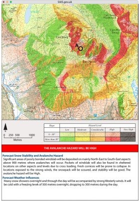
Check out this article on how Scotland looked at using GIS to make cartographic visualizations of predicted avalanche danger areas.
Sir Francis Galton was the first to identify the anticyclone (as opposed to the cyclone), and introduced the use of charts showing areas of similar air pressure – the modern weather map. His book Meteorographica was the first systematic attempt to gather, chart and interpret weather data on a continental scale, a fundamental work of modern scientific meteorology.
Galton prepared the first weather map published in the British newspaper The Times (April 1 1875, showing the weather from the previous day, March 31), now a standard feature in newspapers worldwide. Click below to read more about Sir Francis Galton.

Standing out on the shoreline, have you ever wondered if you set sail straight ahead across the sea what other beach would you run into? Check out the Beyond The Sea interactive map. You can move your mouse along a shoreline or click on a country to visualize all the locations which lie directly across the sea. Location names will be displayed once the track hits land. Colors of the lines represent the different destination continents. Try the Start Fireworks button too for an impressive display!

Looking for that interesting map book or atlas for the cartographic nut in your family? Or maybe for you! Check out this listing of map books that were published or are scheduled to be published in 2018, with a few in 2019.

20 years have passed since the last atlas of desertification was published by the EU. Within that short period, the environment has undergone enormous global changes due largely to human activities. Fortunately, because of the massive increase and growth in the availability of global and regional datasets, and the tools necessary to analyze them, significant progress has been made in understanding human-environment interactions. Continue reading
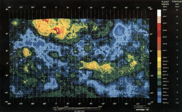
“Every map of a distant place is a picture of the past and a vision of a possible future.” Check out this interesting article about the history of planetary cartography.