COVID-19 Layer in Google Maps

According to Google Maps Help, there is a COVID-19 layer that you can turn on in the Google Maps app on your phone. It displays the 7 day average for the number of new cases per 100,000 people. It also indicates whether cases are increasing or decreasing. More info on the Google blog.

I updated Google Maps on my phone, but it was not there in the layer list. I found this on a Google Maps Help page that new features are rolled out in stages and you might not get it right away. Perhaps it is working for you? Add a comment if you got it to work along with type of cell phone and carrier you have.

UPDATE 9/29/2020 – The COVID-19 layer magically appeared in Google Maps on my Android phone. Looks like the info is at the county level.

ArcGIS Notebooks Webinar

Need to automate data prep and aggregation? ArcGIS Notebooks might be your ticket! Sign up for a 60-minute webinar by ESRI’s spatial data science experts as they walk through how you can leverage the latest updates to ArcGIS Notebooks along with popular open source frameworks to automate, data prep and aggregate for a variety of workflows. The webinar is on September 30, 2020 at 9am PDT. Click here to register.

This webinar is an intermediate level session and serves as a follow up session to the previous recorded webinar, “How to use ArcGIS and Jupyter for Geospatial Data Science.” Watch the recording to learn about the fundamentals of ArcGIS Notebooks, data engineering concepts and more, prior to this session.

FRA Trespassers Casualty Map

The Federal Railroad Administration (FRA) Trespassers Casualty Map is an interactive map that displays all railroad trespasser related injuries and fatalities dating back to June 2011.  The interactive map also allows users to view where trespassing accidents and fatalities occur, trends of where accidents are most concentrated, details on what occurred at accident locations, and the outline of Class I Railroad and Main Line networks.  Check it out!

fratrespassers

Track California Wildfires

If you are looking to track fires in California, stay on top of warnings from local fire officials, and find the latest information on traffic and smoke forecasts, then these interactive maps will help you keep on top of it all.

Cal Fire: This page brings you real-time updates on fire location and containment, as well as updates on evacuation orders and other news.

calfire

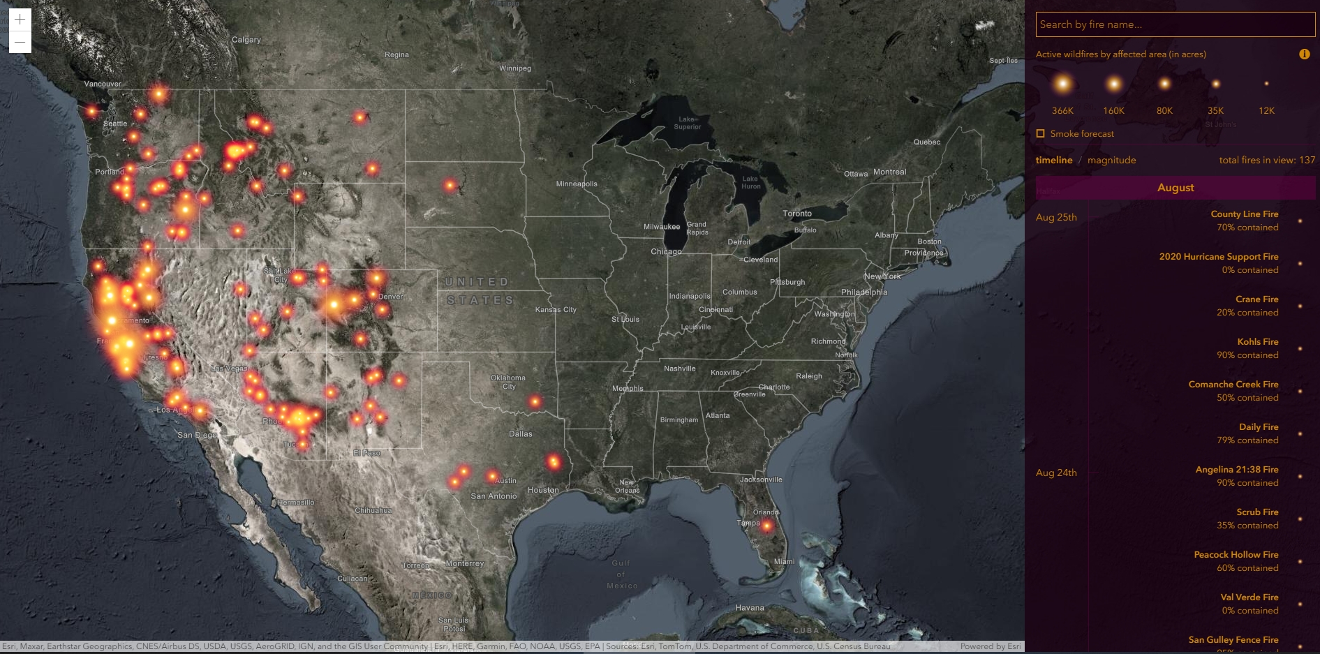
ESRI Wildfire Story Map: This interactive map uses geolocation tools to track a fire’s coordinates and lets you look up additional data like smoke forecasts.

esrifires

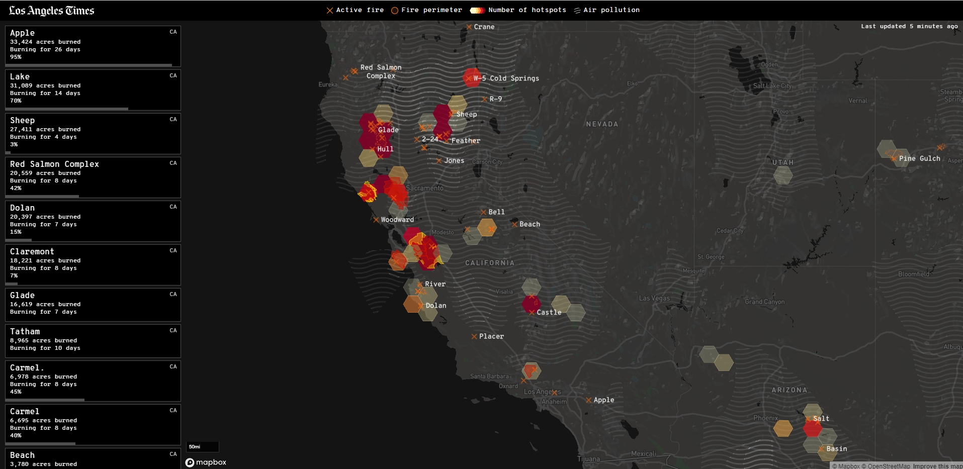
Los Angeles Times: A great source for local fire info, with a nice interactive map and tools.

latimesfire

Mapping Government Spending

Wondering what companies took the government’s SBA Paycheck Protection Program loan?  How about what government agencies received Federal Weapons that were loaned to them?  How about who received Federal Grants?  Or what colleges received Coronavirus Bailout Money?  You can find all this out at Open The Books.  They have mapping applications that allow you to zoom in on your town/county/state to see the data.  Check it out!

openthebooks

Community Mobility Reports

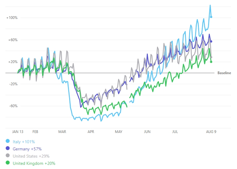
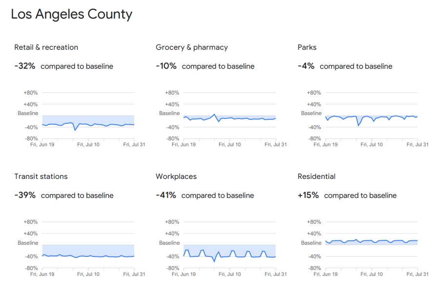
Check out Google’s Community Mobility Reports that provide insights into how people’s movements in countries around the world were altered during the lock down period of COVID-19.  Also you can see mobility change since countries have eased movement restrictions.

The reports use aggregated anonymized data from mobile phones to chart trends in movement over time.  They show how visits to different venues (like retail, groceries, parks, transit stations, etc.) have been effected by government lock downs.  Check it out!

mobilityreports

An overview and how to understand the data can be found here.