Autumn aficionados can track the changing leaves using the new Fall Foliage Prediction Map. Leaves have already started turning in the North East and parts of the West and Midwest. Check it out!

Autumn aficionados can track the changing leaves using the new Fall Foliage Prediction Map. Leaves have already started turning in the North East and parts of the West and Midwest. Check it out!
The Federal Railroad Administration (FRA) Trespassers Casualty Map is an interactive map that displays all railroad trespasser related injuries and fatalities dating back to June 2011. The interactive map also allows users to view where trespassing accidents and fatalities occur, trends of where accidents are most concentrated, details on what occurred at accident locations, and the outline of Class I Railroad and Main Line networks. Check it out!

If you are looking to track fires in California, stay on top of warnings from local fire officials, and find the latest information on traffic and smoke forecasts, then these interactive maps will help you keep on top of it all.
Cal Fire: This page brings you real-time updates on fire location and containment, as well as updates on evacuation orders and other news.

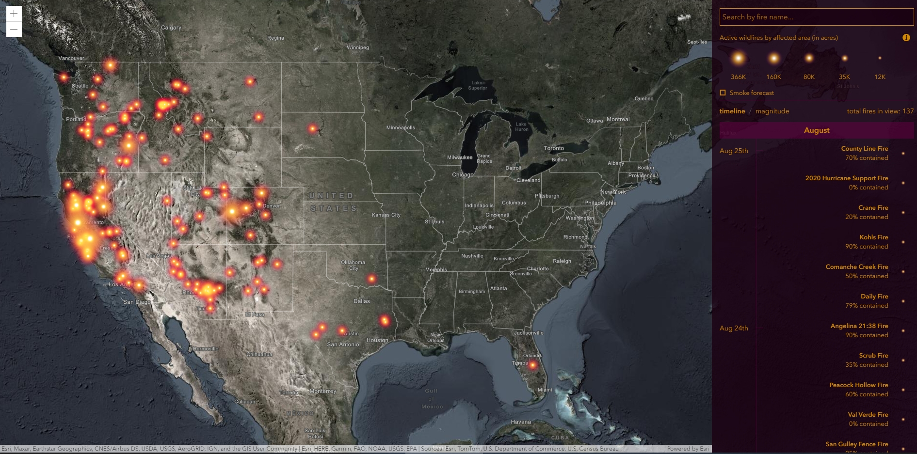
ESRI Wildfire Story Map: This interactive map uses geolocation tools to track a fire’s coordinates and lets you look up additional data like smoke forecasts.
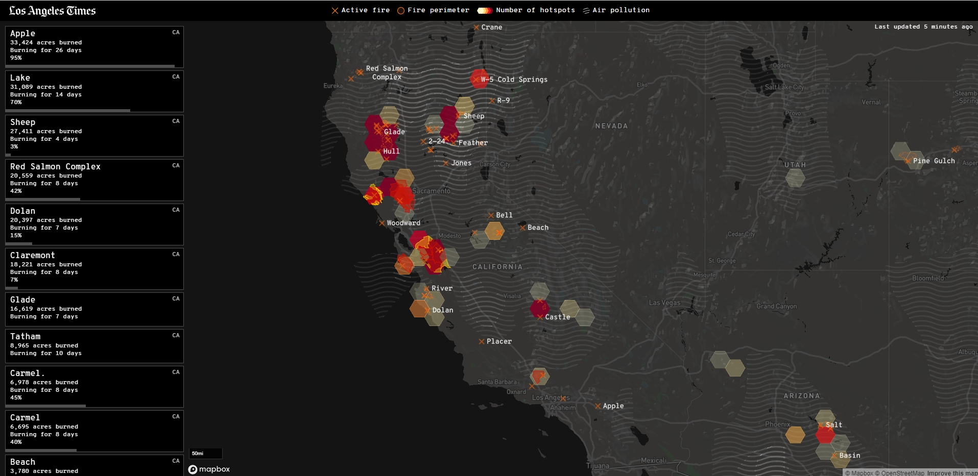
Los Angeles Times: A great source for local fire info, with a nice interactive map and tools.
Wondering what companies took the government’s SBA Paycheck Protection Program loan? How about what government agencies received Federal Weapons that were loaned to them? How about who received Federal Grants? Or what colleges received Coronavirus Bailout Money? You can find all this out at Open The Books. They have mapping applications that allow you to zoom in on your town/county/state to see the data. Check it out!

Besides Google’s Community Mobility Reports, Apple has their own data on COVID-19 Mobility Trends. Their data was generated by counting the number of requests made to Apple Maps for directions in select countries/regions, sub-regions, and cities. The thought is as COVID-19 lock downs go down, direction requests go up. Check it out!
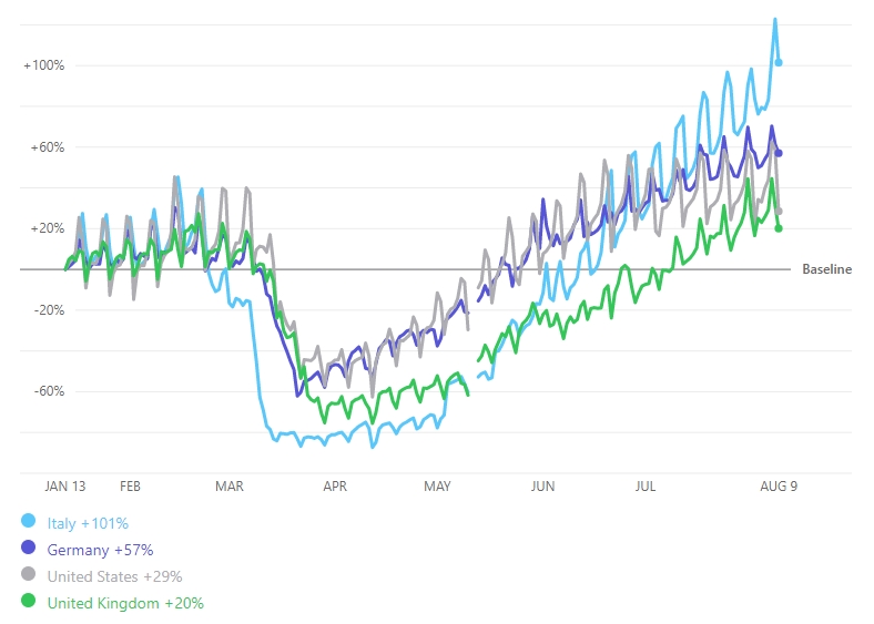
Check out Google’s Community Mobility Reports that provide insights into how people’s movements in countries around the world were altered during the lock down period of COVID-19. Also you can see mobility change since countries have eased movement restrictions.
The reports use aggregated anonymized data from mobile phones to chart trends in movement over time. They show how visits to different venues (like retail, groceries, parks, transit stations, etc.) have been effected by government lock downs. Check it out!
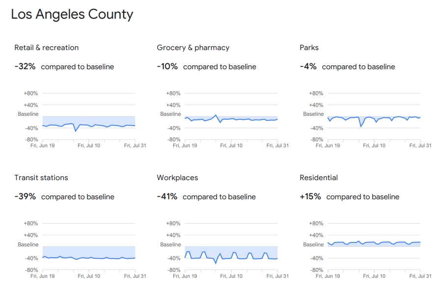
An overview and how to understand the data can be found here.
With summer in full swing and the temperatures increasing, it’s always good to be mindful of fires. The USDA Forest Service has a nice website dedicated to current fire activities. Included are current large incidents, fire detection maps, fire detection GIS data, data on Google Earth, data in web services, and much more. Check it out!

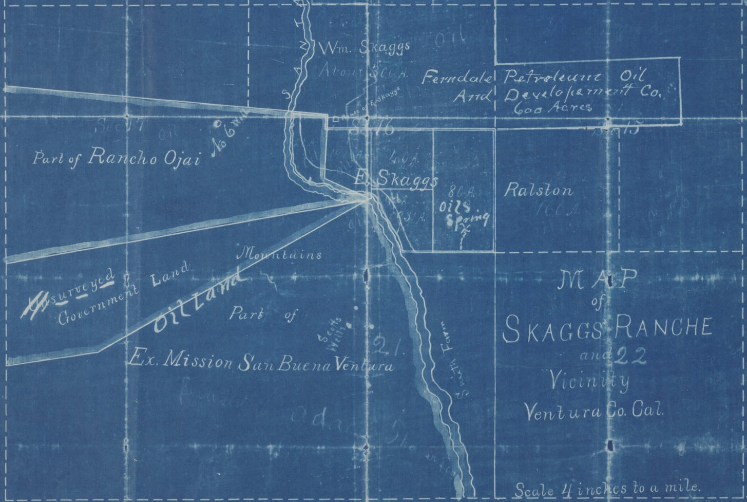
The Huntington Digital Map Collection is an internet catalog of over 8,000 maps of California and the World from The Huntington Library, Art Collection & Botanical Gardens. The maps range from 16th century European portolan charts to 20th century land use maps, including maps owned by British explorer Sir Richard Burton; the Solano-Reeve collection of surveys of Los Angeles and Southern California tracts; and printed tract maps from the Rare Book Collection. You can see all of the available maps in the Huntington collection with thumbnails and short descriptions so you can easily choose the ones you want to view more fully. Check it out!
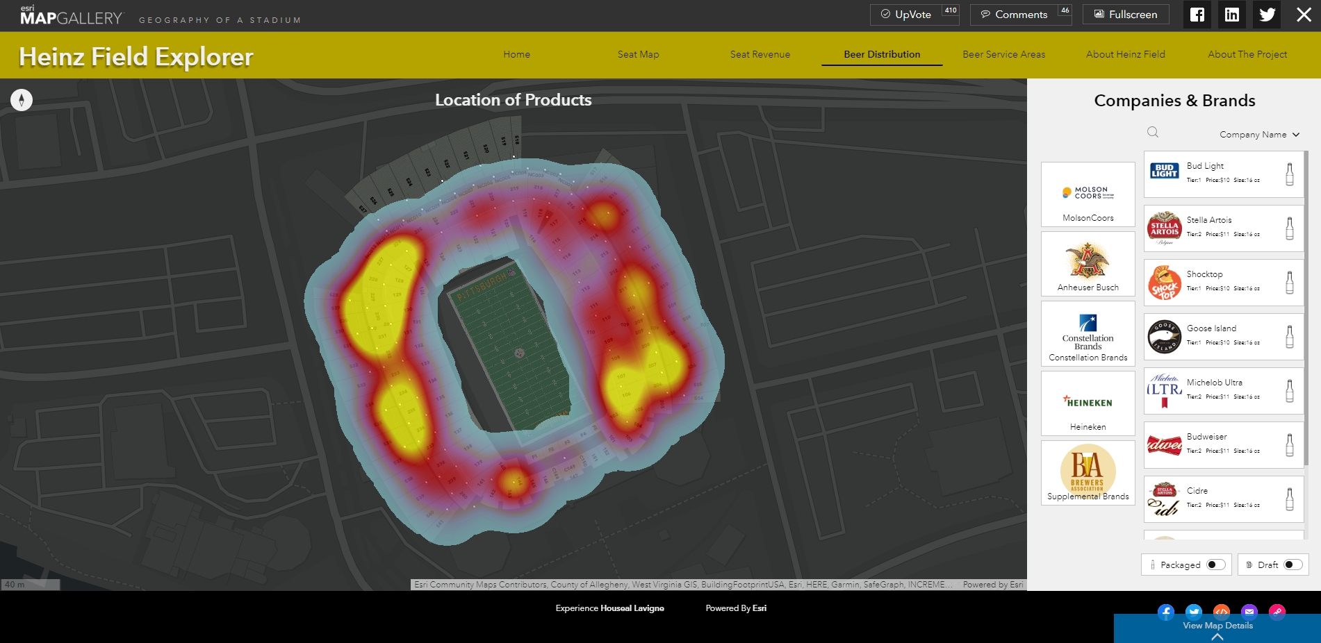
Love maps and beer and football too? Then check out this ESRI Map Gallery submission, “Geography of a Stadium” that explores Heinz Field. Check out the beer distribution!