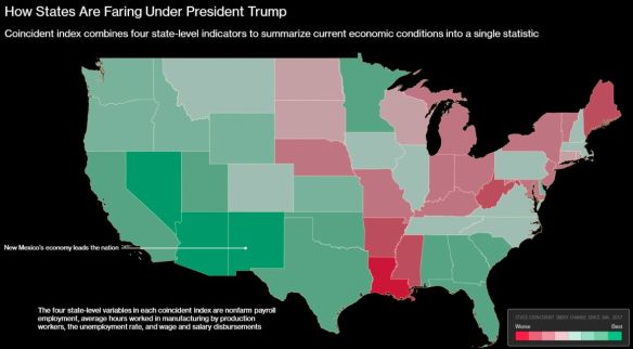
According to an analysis of Federal Reserve Bank of Philadelphia data, the top five states that lead other states in economic gains since President Trump’s inauguration in January 2017 are New Mexico, Nevada, Arizona, California and Georgia. Click the map below to read the short article.
What would be interesting is another map showing what it was before Trump, or a map showing % change.
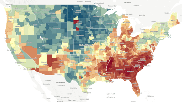
Does the neighborhood you grow up in determine how far you move up the economic ladder? Check out this NPR article and interactive map to explore the Opportunity Atlas.
In a recent poll, more than 10,000 burger fans nationwide were asked to name their favorite burger from a major fast food establishment or restaurant chain. Though the map does not show you the distribution of fast food chains, or lack of certain ones, it does show you people’s preferences in their region. Check out the Burger Map!
What is ArcGIS Indoors? ESRI calls it a complete indoor mapping system that will offer a floor aware location platform providing maps, data, and location info for indoor spaces. Scheduled for release in Q4 of 2018, ArcGIS Indoors is targeted for use in facilities, retail and commercial locations, airports, hospitals, event venues and universities, to analyze, locate, navigate, and to collaborate and share indoor information.
To use ArcGIS Indoors for real time indoor positioning and routing directions, the building you are in needs to be equipped with location technology that connects to your phone or tablet where the app is running. The location technology is not part of the ArcGIS Indoors system, but is needed for it to work. ESRI stated that it has used Apple’s location technology for prototype versions of the system.
The ArcGIS Indoors mobile app is an essential part of the system. The app uses a mobile map package that is hosted in ArcGIS Online. The map package contains all the indoor location info relevant to the building, such as CAD/BIM data, points of interest, transportation networks and vector baselines. The logic of the different building floor levels are defined in Excel spreadsheets, as well as points of interest and feature class information.
Right now there is no quick way of generating an indoor location information model. A variety of data sources can be used to create one, but it would probably be best just to start from scratch if no data exists. If you are familiar with the Campus Viewer Tools, you have some knowledge on what needs to be done. ArcGIS Pro will be used to create information models in a two step process. First you create a lattice network that covers all walkable spaces in a building. Second, this serves as the basis for a thin lattice network with more details, using a special set of toolboxes in ArcGIS Pro. Once created, you push the output to ArcGIS Online as a mobile map package to be consumed by the ArcGIS Indoors app.
Watch this video of the ArcGIS Indoors workshop from the last ESRI User Conference. It will give you a great overview on what you need to do with respect to data and getting it all working:
Also click below for more info on ArcGIS Indoors and sign up to stay informed when it’s released.
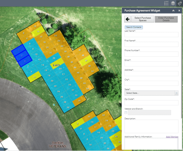
Have a need for cemetery plot management? Check out this Web AppBuilder widget that is a workflow app, from available plots, PDF reports, purchasing status, and search capabilities.
Register for this webinar today to see how you can use your imagery to gain location insight, use machine learning tools in your applications, and explore advanced object detection from your imagery. The webinar is today from 10-11am.
You may enjoy this interesting series of interactive data visualizations showing land use in the continental United States based on different categorizations used by the US Department of Agriculture. I found it interesting when you organize all the categories together that pasture and rangeland would take up most of the Western US and all of the country’s cities and towns would fit in the Northeast. Check it out!