Check out this animated submarine cables map.
Data source from https://www.submarinecablemap.com/.

The Federal Railroad Administration (FRA) Trespassers Casualty Map is an interactive map that displays all railroad trespasser related injuries and fatalities dating back to June 2011. The interactive map also allows users to view where trespassing accidents and fatalities occur, trends of where accidents are most concentrated, details on what occurred at accident locations, and the outline of Class I Railroad and Main Line networks. Check it out!

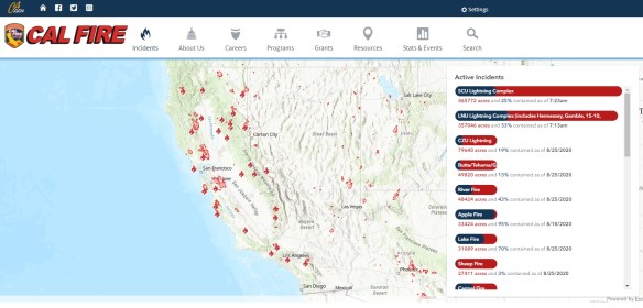
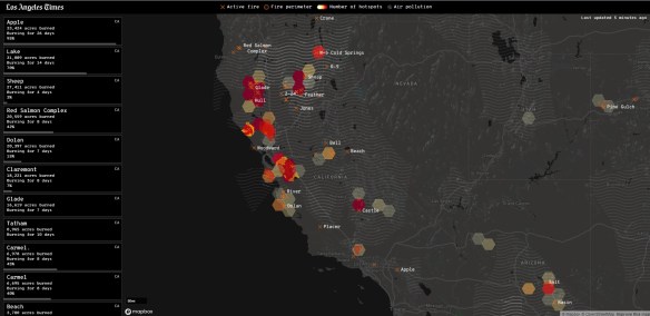
If you are looking to track fires in California, stay on top of warnings from local fire officials, and find the latest information on traffic and smoke forecasts, then these interactive maps will help you keep on top of it all.
Cal Fire: This page brings you real-time updates on fire location and containment, as well as updates on evacuation orders and other news.
ESRI Wildfire Story Map: This interactive map uses geolocation tools to track a fire’s coordinates and lets you look up additional data like smoke forecasts.

Los Angeles Times: A great source for local fire info, with a nice interactive map and tools.
I remember 30 years ago working on ESRI’s COGO software. If you ever used it back in the day, you were a hero creating a landbase from scratch with only measurements from tract and parcel maps and making sure everything closed well with your traverses.
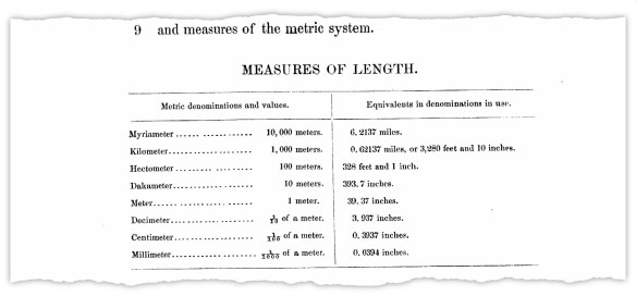
One thing I found interesting was there were two definitions for measuring 1 foot. There was the international foot, which was defined as 1 inch = 2.54 centimeters exactly, or 1 foot = 0.3048 meters exactly. The other was the older US survey foot, which was defined as 39.37 inches = 1 meter exactly, or 1 foot = approximately 0.304800609601 meters, or multiplying US survey feet by the fraction 1200/3937 to get meters.
The US survey foot has been around since 1893 while the international foot was established in 1959 and is slightly more exact. One of the reasons we retained the US survey foot was because of our state plane coordinate systems, which were derived from the national geodetic control network, and are based on the relationship of 1 meter equaling 39.37 inches exactly. Fundamental survey units, such as rods, chains, statute miles, acres, sections, and townships, all depend on the relationship of 1 meter equaling 39.37 inches exactly.
Using two measurements for the same unit have been confusing over the years. But now the US survey foot will be obsolete by January 1, 2023. Click below to read more about it!
Teachers should check out this ESRI webinar on August 19th, taking a look at geospatial tools for any classroom: home, outdoors, school, or virtual. Click here for more info and to register.
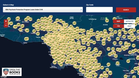
Wondering what companies took the government’s SBA Paycheck Protection Program loan? How about what government agencies received Federal Weapons that were loaned to them? How about who received Federal Grants? Or what colleges received Coronavirus Bailout Money? You can find all this out at Open The Books. They have mapping applications that allow you to zoom in on your town/county/state to see the data. Check it out!
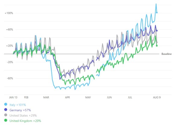
Besides Google’s Community Mobility Reports, Apple has their own data on COVID-19 Mobility Trends. Their data was generated by counting the number of requests made to Apple Maps for directions in select countries/regions, sub-regions, and cities. The thought is as COVID-19 lock downs go down, direction requests go up. Check it out!
Learn GIS from home this fall! Rio Hondo College GIS courses start August 15th. Classes are entirely online. More information can be found at www.riohondo.edu/gis . Fall classes include both courses in Geographic Information Systems and new course offering on preparing for exam to pass Remote Pilot (Drone) Commercial Exam which includes survey mapping workflow.
Frequently Asked Questions
For additional information, contact Prof. Warren Roberts wroberts@riohondo.edu (P.S. Did you know select Rio Hondo GIS courses are transferable courses to CSU and other universities?)
Check out Google’s Community Mobility Reports that provide insights into how people’s movements in countries around the world were altered during the lock down period of COVID-19. Also you can see mobility change since countries have eased movement restrictions.
The reports use aggregated anonymized data from mobile phones to chart trends in movement over time. They show how visits to different venues (like retail, groceries, parks, transit stations, etc.) have been effected by government lock downs. Check it out!

An overview and how to understand the data can be found here.
