Check out this map showing the autocomplete predictions of a “cost search” for each state’s capital. The search phase was “how much does a * cost in …”. Some of the autocomplete predictions were rather … well, you will see!


Check out this map showing the autocomplete predictions of a “cost search” for each state’s capital. The search phase was “how much does a * cost in …”. Some of the autocomplete predictions were rather … well, you will see!
Back in 1913, the National Highway Association drew up the first proposed highway plan. Their campaign stressed that good roads lead to things like good schools, good health, good morals, good times, etc. Check out the article and maps leading up to the nation’s first nationwide system of numbered highways adopted in November 1926.

Check out this story about how a previously unknown map collection of a hospital dietician ended up doubling the size of the Los Angeles Public Library’s map archives in one single day!

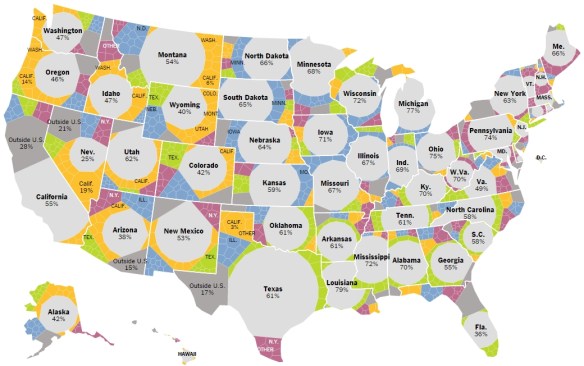
This interesting and interactive map comes from the New York Times. A lot of information is displayed showing migration information by state. Very good use of colors and symbols to show multi layered migration data. Select a year, then hover over the different areas of the state to get more info. Check it out.
Curious on how to make a wind map? Or maybe just a map of magnitude and direction of flow? I found this post that steps you through the process using ArcGIS Desktop.

Interested in map history? Doing a research projected in map history or cartography? You might want to check out The International Directory of Researchers in Map History.
The purpose of the directory is to promote communication among researchers who study the history of maps and to provide information about the field to the public. The directory is an open source for contact information, current interests, research projects, and publications related to map history. Check it out.
ESRI has updated ArcGIS Online for March. One of the big ones is what they call Smart Mapping which include new ways to symbolize data, “smart” defaults, and data-driven workflows. Check it out.
Check out HistoricPlacesLA.org. It is the first online information and management system specifically created to inventory, map, and help protect the City of Los Angeles’ significant historic resources. It showcases the city’s diversity of historic resources, including architecturally significant buildings and places of social importance, as well as historic districts, bridges, parks, and streetscapes.
Thanks goes to Barry Waite at the City of Carson for pointing out this resource.
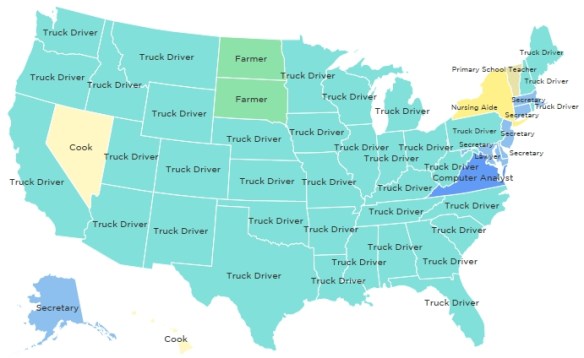
Check out this map from NPR’s Planet Money blog depicting the most common job in each state from 1978 to 2014. What emerges is a story of changing economic, demographic, and technological circles over a period of 36 years. There sure were a lot of truck drivers in 2004 … “puttin’ the hammer down on the super slab”!
If you use ArcGIS Online to publish maps and apps, ESRI’s December update brought some new options for customizing and embedding maps.


