New 2020 Global Land Cover Map

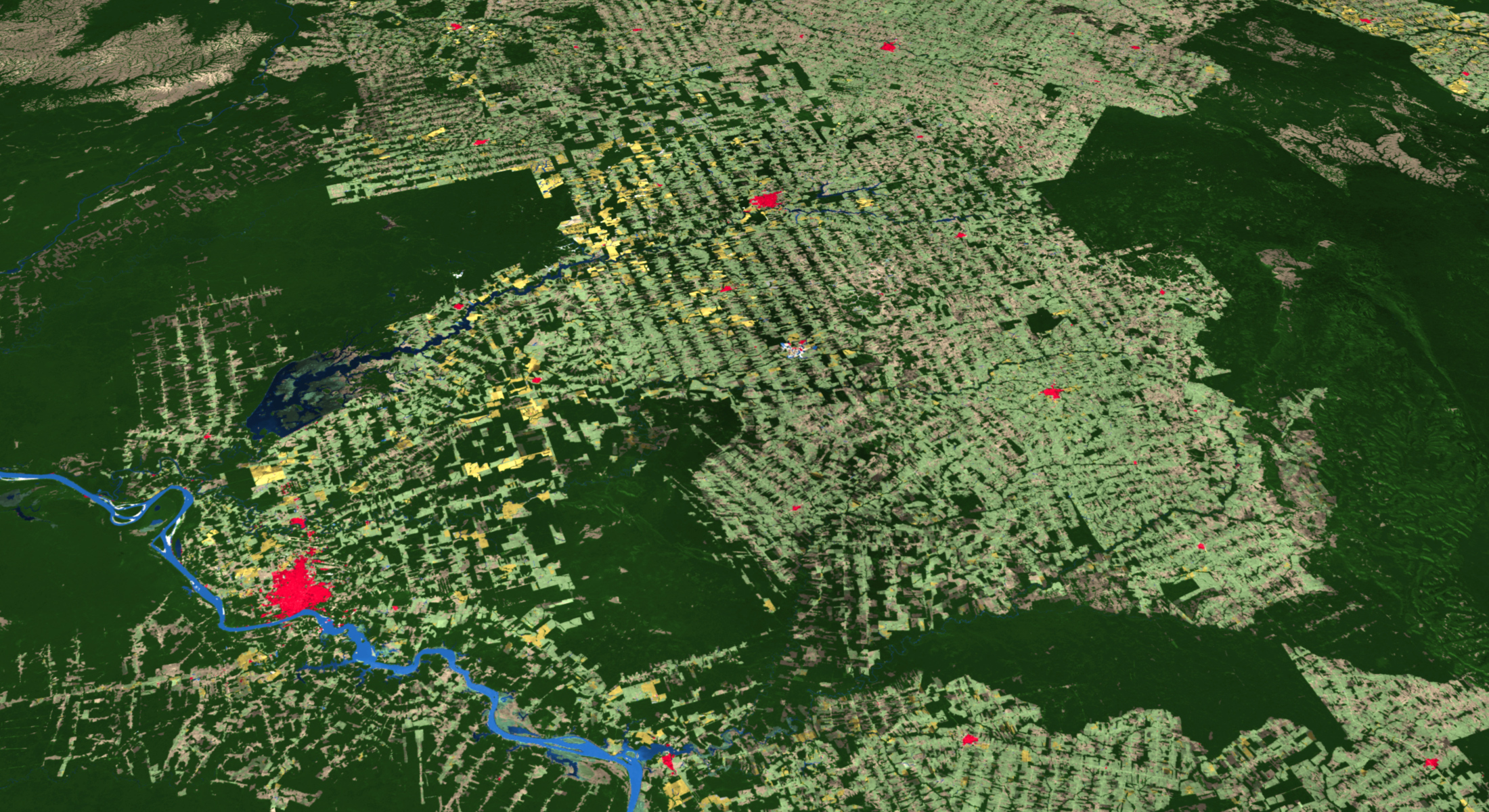
ESRI has released a new 2020 Global Land Cover Map Service in ArcGIS Online, part of their Living Atlas datasets.

The map was built using European Space Agency (ESA) Sentinel-2 satellite imagery, and developed using a new machine learning workflow. The 2020 land surface data is at 10-meter resolution and includes categories such as water, trees, grass, flooded vegetation, crops, scrub/shrub, built area, bare ground, and snow/ice. There is also a cloud and no data category. Check it out!

LEGO Art World Map

If you like maps and LEGOs, then this is for you! This new addition to the LEGO Art collection contains the most pieces ever included in a set in LEGO’s history … 11,695 pieces! The world map measures 25.5 inches high by 40.5 inches wide when completed. The map is made up of 40 interconnecting base plates which are divided into three sections for the build that can be arranged in one of three ways, allowing you to place your favorite part of the world in the center of the map.

And check this out, there are customizable brick-built push pins that you can use to mark out destinations already visited or highlight those still on your bucket list! All of this for only $249.99! Available June 1st. Check it out!

US High Tide Flooding Probability

High tide flooding today mostly affects low-lying and exposed assets or infrastructure, such as roads, harbors, beaches, public storm-, waste- and fresh-water systems and private and commercial properties. High tide flooding is likely more disruptive (a nuisance) than damaging. The cumulative effects, however, are becoming a serious problem in several coastal locations.

See where high tide flooding is probable over the next 80 years and how many flood days are expected annually with the High Tide Flooding app using NOAA study data.

The Mythology of Snow’s Map of Cholera

Most of you that took Geography, Cartography, or GIS courses remember reading about the story of Dr. John Snow and his map showing the cholera outbreak in Soho, London in 1854.

You also probably remember how he plotted cholera cases on the map and how he used that information to figure out that there was a strong spatial relationship between the cases and a polluted well on Broad Street, so he had the pump removed and the outbreak stopped. The map has been used as an example of the principles of GIS using layers of information and spatial relationships.

Well … despite it being a great story, unfortunately it’s not really how it played out. Both the use of the famous map and the story surrounding it have become somewhat modified through the passage of time. Click below to read the mythology of Snow’s cholera map.