With the recent high winds and SCE turning off power so their high power lines don’t spark a fire, you wonder how we got here? Well, it started back in October 2007 when wildfires driven by strong Santa Ana winds burned hundreds of square miles in Southern California. Some of the worst wildfires were reportedly ignited by overhead utility power lines. Continue reading
Author Archives: socalgovgis - Michael Carson
The Kingdom of California
The Santa Barbara Museum of Natural History will exhibit “The Kingdom of California: Mapping the Pacific Coast in the Age of Exploration” through January 2nd. The exhibition displays 17th to 19th century maps and books, including maps showing California as an island as well as 19th century coastal charts. Entry to the exhibit is free with paid museum admission. Check it out!
A Map of Every Building In America
This one is interesting! The New York Times has created a page with an interactive map showing every building in the US. How did they do this? They used data from a huge database that Microsoft released to the public this year. Microsoft’s computer engineers trained a neural network to analyze satellite imagery and extract out shapes of 125,192,184 buildings across the country. Click below and read on!
Citizens Favor a More Digital Government
In a recent survey of citizens across the world it was found 86% view digital delivery of public services “as equally or more important” than traditional methods of public service delivery. And most are willing to provide personal or potentially sensitive data to improve the personalization of services. For example, 73% of citizens polled would provide biometric data such as fingerprints, retinal scans, or voice identification to government in exchange for more personalized service. Of course Americans were about 10 percent less likely than their global counterparts to share personal information to improve government service delivery … I don’t blame them! Click below to read more.
Harvard WorldMap
Harvard University’s Center for Geographic Analysis (CGA) has created Harvard WorldMap, an online open-source mapping platform developed to lower barriers for scholars who wish to explore, visualize, edit, and publish geospatial information. WorldMap was created to provide a mapping platform that supports large datasets that also allows collaboration. Anyone can create their own online mapping portal, upload large GIS layers and overlay them with other layers, and control access to their data. Check it out!
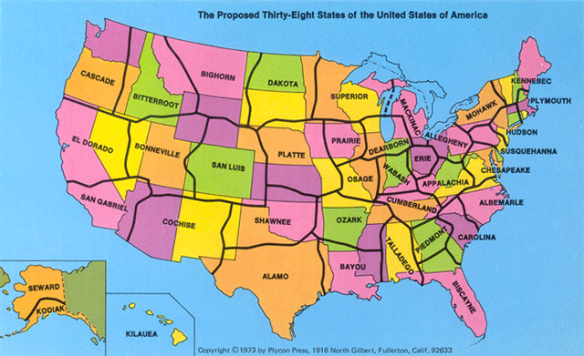
Proposed 38 States of the USA
In 1973, a California State University geography professor suggested that the US redraw its state boundaries and reduce the number of states to 38. State lines were to be drawn in less populated areas, isolating large cities and reducing their number within each state. Thus with fewer cities vying for state tax dollars, more money would be available for projects that would benefit all citizens. Alas, the idea died in Washington. Click below to read more about it.
Free Pass to GIS-Pro/CalGIS 2018
If you do not have the cash to attend the GIS-Pro/CalGIS 2018 conference in Palm Springs next week, you can get a free pass to visit the exhibit hall area October 10 or 11. Click here for more details.
IPAWS National Test Today
FEMA and FCC will conduct a nationwide test of the Emergency Alert System (EAS) and Wireless Emergency Alert (WEA) system. That means today you will receive a WAS test message on your cell phones that are connected to wireless providers participating in WEA. Cell towers will broadcast the WEA test for approximately 30 minutes beginning at 2:18pm EDT (11:18am PDT).
So when your cell phones start screaming at you, that is what’s going on! For more information, visit https://www.fema.gov/emergency-alert-test.
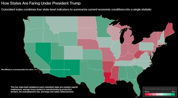
How is Your State Faring Economically?
According to an analysis of Federal Reserve Bank of Philadelphia data, the top five states that lead other states in economic gains since President Trump’s inauguration in January 2017 are New Mexico, Nevada, Arizona, California and Georgia. Click the map below to read the short article.
What would be interesting is another map showing what it was before Trump, or a map showing % change.
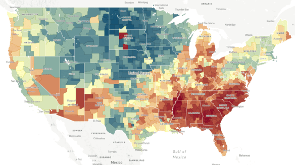
The Opportunity Atlas
Does the neighborhood you grow up in determine how far you move up the economic ladder? Check out this NPR article and interactive map to explore the Opportunity Atlas.