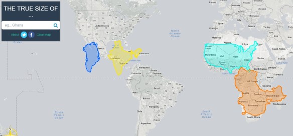
For the past several centuries, cartographers have tried to find different ways to portray the globe on a two-dimensional map. Many of these attempts, including the Mercator projection, distort the true size of different countries and regions. As a result, many of us have false perceptions about the proportional size of different geographical areas.
Check out this interactive map application that allows you to compare the size of different countries and see how the Mercator projection has influenced our perceptions of country size. You basically move the countries around on the map to compare size and shape.