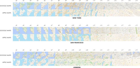
Check out this essay comparing the cartography between Google Maps and Apple Maps. In summary:
- Apple Maps, on average, labels more cities than Google at every zoom.
- Google Maps, on average, labels more roads than Apple on nearly every zoom.
- For two-thirds of zooms, both maps generally show the same number of roads. For the remaining third, Apple shows more roads.
- Both maps, on average, label a similar number of Points of Interest (POIs) — but have only 10% of their POIs in common on an average zoom.
- Both maps also prioritize different kinds of POIs: Google Maps heavily prioritizes transit, while Apple prioritizes landmarks. Apple also generally shows a greater number of POI categories on a given zoom — and shows twice as many restaurants and shops as Google.
Click below to read the 2 part post.