
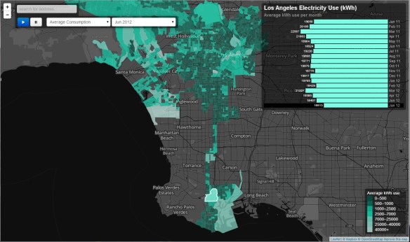
Researchers at UCLA have put together an interactive map showing electrical use in the City of Los Angeles neighborhoods. The data is organized by block group and shows the average amount of electricity used per customer for each month over a one and a half year peroid, how that compares to other neighborhoods, and how energy use has changed over the study period.
You can hover over block groups on the map to see electricity usage (kWh) over time, switch between average use per month and percent change from one month to the next, zoom in and click to show land use, income, and other characteristics, and animate the usage over time.
The app is best viewed in Chrome, Firefox, and Safari … sorry Internet Explorer!

That’s a neat way to show the data – thanks for sharing!
It would be helpful if the tool allowed filtering by customer group (i.e. residential, commercial etc) – this would help with reaching some meaningful conclusions. For example, it’s expected that an area with a mix of residential and commercial accounts will have a higher usage rates than a purely residential area. it would be more interesting to see how residential use compares across the region..